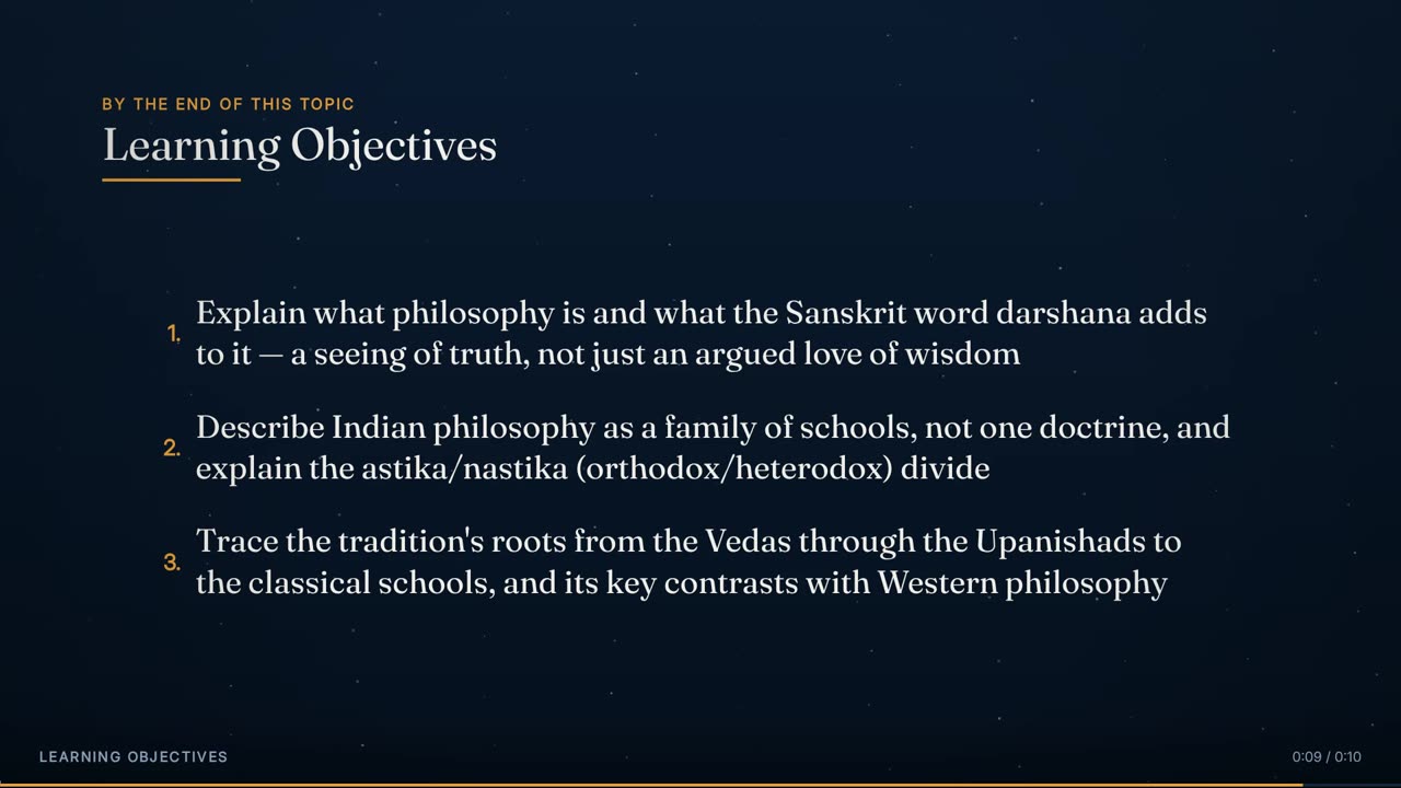
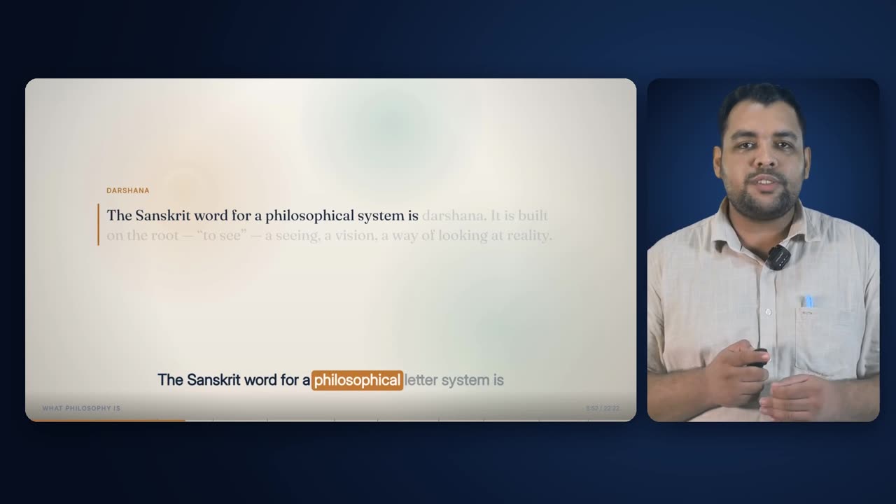
Engine/Effects/Visual Enhancement

Animated Teaching Visuals

Short cutaways drawn in code rather than generated: an icon, a few words and a slow move, cut in for a phrase or two to carry an idea no camera could be pointed at. They follow the course's style, land on the words they illustrate, and keep the captions running over the top.

Drawn cutaways · 4 treatments · 4 shapes

The finished effect

What it looks like when it is done.

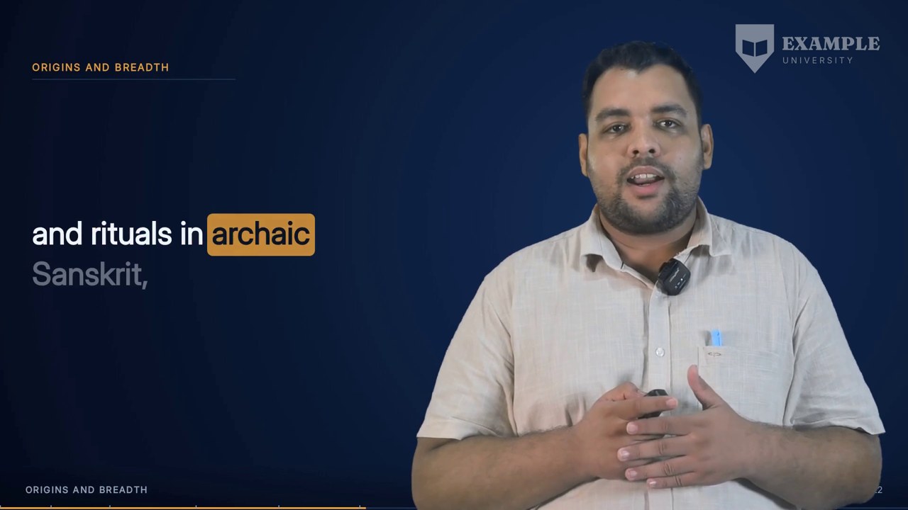
Twenty-two seconds of the 22-minute Indian Wisdom lecture used throughout this page (6:00 to 6:22 of the lecture): three drawn cutaways in a row — a versus and two focus scenes — cut into Presenter + Animated, each on the phrase it illustrates, with the caption band carried straight over them. Every title has at least 88 px of clear space under it before the drawing begins.

22 s · 1920 × 1080 · with sound

Overview

What it is, and why it exists.

An Animated Teaching Visual is a full-screen cutaway, three to seven seconds long, that leaves the lecture's current view — the full-frame deck, the presenter beside the slide, or the presenter with captions — for an original illustration of what is being said, then returns. It is one of three kinds of cutaway, alongside generated stills and generated video clips, and it has its own budget so it never competes with them for the same seconds.

It exists because most of a lecture cannot honestly be photographed. A roadmap ('by the end of these twenty minutes'), a definition, a distinction between two schools of thought: asking an image model for any of these is how a lecture on human resources ends up illustrated with a field of cows. A drawn scene can carry the idea itself, it costs nothing to make, and it cannot fabricate a person, a place or a document.

The composition plan decides where each drawn cutaway goes and which motion treatment it gets; a short scene description for the lecture decides what is drawn there — a shape, a kicker and headline, icons and short lines, each tied to the phrase that introduces it; and a dedicated renderer draws each one to its own clip, which is dropped into the film under a fresh caption band.

It depends on the word timeline, the composition plan's phrase boundaries and budgets, the course's template style, and the loudness envelope. Every cutaway is named by its own start time in hundredths of a second — the cutaway at 58.19 s is 5819 — so the plan, the scene description, the renderer and the assembler can never disagree about which clip is which.

1 a minute, its own quotaBudget
14% of the runtimeScreen-time ceiling
2.8-7.5 s, ideal 5 sClip length
4, never the same twice runningTreatments
row, versus, focus, chainShapes
17 plain icons, no letteringIcon set
one move per clip, up to 6% pushCamera
none — drawn, not generatedCost

How it is made

Step by step, in the order the engine runs it.

Find the candidate windows

The planner lists every window of one, two or three consecutive caption phrases between 2.8 s and 7.5 s long, starting after the first 15 s and ending before the last 25 s, not straddling a beat or layout edge and at least 1 s clear of any layout change. Each is scored for concreteness, lists, comparisons, processes and numbers, and penalised for pure connective phrases.

Decide what may be generated and what must be drawn

A window that names a real entity or reads as a document, chart, statistic or headline can never be a generated picture; it can only be drawn. A window with nothing a camera could point at is also drawn. Everything else is eligible for a generated still or clip.

Place drawn cutaways against their own quota

Stills and drawn cutaways take turns, each serving whichever kind is furthest behind its per-minute target, so neither eats the other's schedule. Drawn cutaways are held to 14% of the runtime. No cutaway may overlap another, start within 6 s of another's start, crowd more than 14 into any 120 s, or land on a definition, quote or hero.

Close the gaps

A final pass walks every stretch with no cutaway. The first picture must arrive by 90 s and no stretch may run 60 s without one. Where the ordinary pool has nothing for a stretch, a wider pool with no score bar is used — and anything taken from it is forced to a drawn treatment, never a generated photograph.

Choose a treatment

Each drawn cutaway is given one of four treatments by rule: Progressive Build-On if the phrase lists, sequences or compares; Pan & Zoom if it is under 6 s; Floating & Pulsing Glow if it sits over the caption layout; otherwise Parallax, then the others in turn. A treatment is never used twice in a row.

Compose the scene

For each drawn cutaway the scene description names a shape (row, versus, focus or chain), a camera move (push, pull or drift), a kicker, a headline and the items — each with an icon and the phrase that introduces it. Every phrase is looked up in the transcript starting 4.5 s before the clip, converted to seconds from the clip's start, and a phrase that cannot be found stops the build.

Draw each clip

The renderer draws each scene at 30 fps for exactly the cutaway's length, in the course's style and in the light or dark palette of the chapter it lands in, and writes one clip per cutaway id. A clip that already exists and is complete is kept; one smaller than 10 KB is redrawn.

Cut it in, with captions on top

The assembler takes the clip for each cutaway id, fits it to the 1920 x 1080 frame, and overlays the caption band drawn fresh for that window. The narration underneath is untouched. If a clip is missing, the piece falls back to the layout underneath and the assembly record says so.

Elements

Everything this effect puts on screen, one piece at a time.

Each element below is shown as the engine actually produced it, in the real lecture, with its parts, and the rules that govern it.

0:30 — 'what this course gives you': a slow push on the mortarboard.
01

Pan & Zoom

Treatment: the camera eases toward the payoff

Pan & Zoom treats the illustration as an oversized still and moves a crop across it, easing in toward the element the phrase is building to — a culminating idea, a checkmark, the last item in a short sequence. The move follows a smoothstep curve, so it starts and ends at rest and never jolts at the cut. It is the planner's first choice for any cutaway shorter than 6 s. In the drawn-scene renderer the same idea is carried by the push: the whole scene scales from 100% to 106% over the clip. In the lecture below it opens the drawn cutaways at 0:30, pushing in on a mortarboard as the lecturer says what the course will cover.

Anatomy
  • Reference treatment: illustration built at 2304 x 1296 (1.2x the frame); crop eases from the whole canvas to a 1340 x 754 box on the payoff
  • Drawn-scene push: scale 1.00 to 1.06 around the frame centre, smoothstep over the whole clip
  • Pull variant: 1.06 back to 1.00
Rules
  • Chosen first for clips under 6 s
  • Every element is checked at both ends of the move so nothing is caught crossing the frame edge; outlying parts fade out before the crop reaches them
  • Never follows another Pan & Zoom directly
1:40 — 'darshan, a seeing, a vision of truth': the consequence arrives on its words.
02

Progressive Build-On

Treatment: the camera holds; the parts arrive on their words

Progressive Build-On keeps the camera still and lets the scene assemble itself: each part scales up from small with a slight overshoot and fades in on the word that introduces it, while any connecting path draws itself alongside. Timings come from the word timeline, not an even spread, so the reveal is choreographed to the speech. The planner reaches for it first whenever the phrase is a list, a process or a comparison. Every drawn scene in the current renderer uses this word-cued build for its cards and pills, whatever its camera move.

Anatomy
  • Part entrance: 0.42 s (cards in rows and chains), 0.45 s (versus panels, focus pills)
  • Scale 0.88 to 1.00 with a 3.5% overshoot bump; opacity reaches full at 83% of the entrance
  • Border pulse: 3 px plus up to 3.4 px, scaled by the speaker's emphasis, fading as the part settles
  • Reference treatment: static crop inset 192,108 of the 1.2x canvas
Rules
  • First choice when the phrase lists, sequences or compares
  • Each part's time is the start of its own anchor phrase, measured from the start of the clip
  • A part whose word falls after the clip ends is reported before rendering
4:02 — 'the questions keeping him awake are older than he knows'.
03

Parallax Layers

Treatment: layers drift at different rates for depth

Parallax holds the camera and moves the layers instead: background, glow and foreground drift at different speeds and amplitudes, giving depth without any one element visibly panning. It suits a scene-setting beat with no single focal point, or a contrast after a base view that already has plenty of motion. In the drawn-scene renderer the ground's dot field drifts on its own slow paths beneath a foreground that moves with the scene, so the two planes separate as the clip runs.

Anatomy
  • Reference treatment: three layers at 0.30, 0.62 and 1.00 of the motion, amplitudes 10, 17 and 26 px
  • Horizontal drift sin(0.42 t), vertical cos(0.33 t) at 55% of that
  • Resting crop inset 160,90 at 1984 x 1116 so drift never exposes an edge
  • Drawn-scene ground: 120 dots drifting up to 13 px across and 9 px down, independently of the scene layer
Rules
  • Needs the illustration built as separable layers
  • The resting crop is inset so no layer ever shows its edge
9:45 — the Upanishads, 800 to 500 BCE, over the caption layout.
04

Floating & Pulsing Glow

Treatment: a still composition that only breathes

The calmest of the four. The composition is complete from the first frame and the only motion is ambient: each element bobs a few pixels on its own sine wave, out of phase with its neighbours, and the glow behind it breathes. It is the planner's choice for a cutaway that has to sit under a long or dense caption, especially beside the presenter in the caption layout, where camera motion would compete with reading. In the drawn focus scene the centre icon and its glow breathe together by 3%.

Anatomy
  • Reference treatment: bob of 9 px on sin(1.25 t + 1.9 i); glow opacity 0.18 + 0.12 x breathe on sin(1.5 t)
  • Drawn focus scene: icon and glow scale 1 + 0.03 sin(1.4 t), about one breath every 4.5 s
  • Glow is a true radial gradient that reaches zero well inside its own radius
Rules
  • Preferred over the Presenter + Captions layout
  • Never a blurred hard-edged circle — that leaves a square smudge
The row shape: icon cards arriving as each is named.
05

Row

Shape: two to four icon cards landing on their words

The plainest shape and the one that fits anywhere: a kicker and headline, then a row of two to four cards, each an icon above a label, landing on the words that name them. Slots still to come are dashed ghosts. The row is centred in the space between the headline and the caption band, never less than 88 px under the headline. Two cards are set larger than four, so a pair does not float in the middle of an empty frame. Five of the nineteen drawn cutaways in the lecture below are rows.

Anatomy
  • Kicker at y 156; headline at y 268 (232 when there is no kicker)
  • Card width: up to 560 px for two, 470 px for three, 410 px for four, within a 1620 px row; gap 64 px for two, 44 px otherwise
  • Card height: up to 430 px (1.02 x width), and never more than the space left between the title and y 796
  • Cards centred in that space, so they start at least 88 px below the headline
  • Icon at 40% of the card height, label at 80%, label fitted 40 to 22 px
Rules
  • Each card cued to its own phrase
  • Unarrived cards are 2.6 px dashed outlines at 75% opacity
The versus shape: two sides, then the verdict.
06

Versus

Shape: two panels held against each other

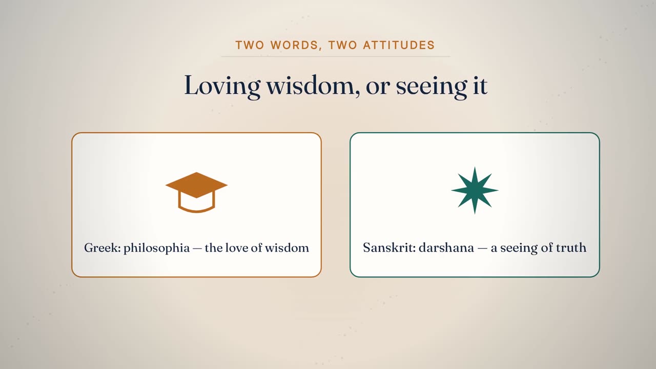
Versus sets two sides against each other for a comparison the lecture settles: two tall panels, the left outlined in the accent colour and the right in the second accent, each with one or more icons and a label, and an optional verdict in tracked capitals that lands under both once they are up. In the lecture below it carried the difference between the Greek word for philosophy and the Sanskrit one.

Anatomy
  • Panels 690 px wide, 80 px apart, radius 26 px, 3 px outline; up to 420 px tall, shortened to fit the space under the title
  • Panels and verdict centred together in the space between the title and y 796
  • Icons scaled with the panel, 168 px apart, centred at 40% of the panel
  • Label: display 600, fitted 44 to 24 px at 80%
  • Verdict: UI 700, 34 px, tracked 4 px, 56 px below the panels, fading in over 0.5 s
Rules
  • Each side lands on its own phrase
  • The verdict never precedes both sides
The focus shape: one icon, its consequence arriving on its word.
07

Focus

Shape: one idea in the middle, its consequences around it

Focus is for the moment a lecture wants one thing looked at and nothing else. A single large icon sits in a soft accent glow that breathes; the headline sits above it, and the consequence labels arrive on their own words beside and below the icon, each tied to the icon's edge by a dashed leader. Nothing is ever placed above the icon, because above the icon is the headline: an earlier version put the first label directly over the icon, which sat it on the headline in most scenes. With one label it goes under the icon; two go left and right; three add one underneath; four and five use upper and lower positions on each side. The icon shrinks before anything is allowed to crowd the title or the caption band.

Anatomy
  • Icon and labels centred in the space between the headline (plus 88 px) and y 796
  • Icon radius 150 px (drawn at 1.5x), shrinking to as little as 90 px when space is short; glow radius twice the icon, 17% accent
  • Headline: display 700, fitted to 1480 px from 64 to 36 px
  • Label slots: 1 = below; 2 = left, right; 3 = left, right, below; 4 = four sides; 5 = four sides and below
  • Side labels sit 84 px off the icon edge, measured to their own width; the label below sits 36 px under the icon
Rules
  • One idea per scene
  • Labels do not exist until their word
  • Never a label above the icon — that space belongs to the headline
The chain shape: each arrow drawing ahead of its card.
08

Chain

Shape: a sequence, with arrows drawn as it is said

Chain lays icon cards left to right for anything with an order — a process, a life cycle, a history — and draws each arrow just before the card it points at lands, so the arrow leads the eye to the next idea.

Anatomy
  • Cards up to 380 x 340 px, 96 px apart, centred in the space between the title and y 796
  • Arrow: 4 px, second accent; starts 0.35 s before the next card's word, grows over 0.45 s from a 12% stub
  • Arrowhead 16 x 20 px once 60% drawn; arrow opacity 28% to 100%
Rules
  • Arrows lead their cards, never trail them
  • Unarrived cards are ghosts
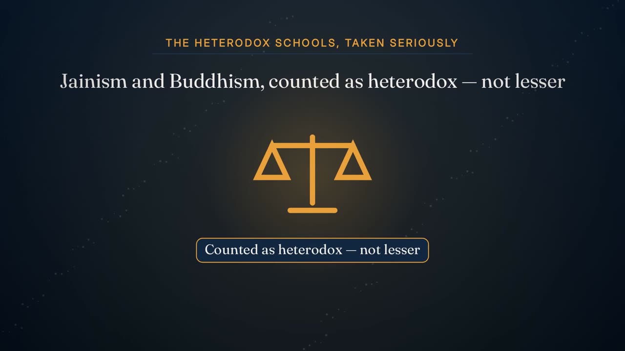
12:04 — 'The heterodox schools, taken seriously'.
09

Kicker and headline

The words that tell the viewer what the picture is about

Every drawn scene is titled: a short kicker in tracked accent capitals with a hairline under it, then a headline in the display face. The kicker names the idea (THE HETERODOX SCHOOLS, TAKEN SERIOUSLY); the headline says it in a sentence. Both are written for the scene, not quoted from the transcript, because the caption band is already carrying the exact words underneath. The title block is measured, not assumed: the renderer takes the real height of the headline as set, adds 88 px of clear space, and only then places the drawing, centred in what is left above the caption band.

Anatomy
  • Kicker: UI 700, 30 px, tracked 5 px, accent, centred at y 156
  • Rule under the kicker: 2 px line colour, text width + 80 px, at most 1200 px
  • Headline: display 700, fitted to 1480 px from 74 px down to 36 px (64 px in focus scenes), centred at y 268 — or y 232 with no kicker
  • Title clearance: whatever sits under the title starts at least 88 px below the lowest ink of the headline
Rules
  • Written, not quoted
  • No lettering inside the icons themselves
  • Nothing drawn within 88 px of the headline; the renderer measures it on every clip
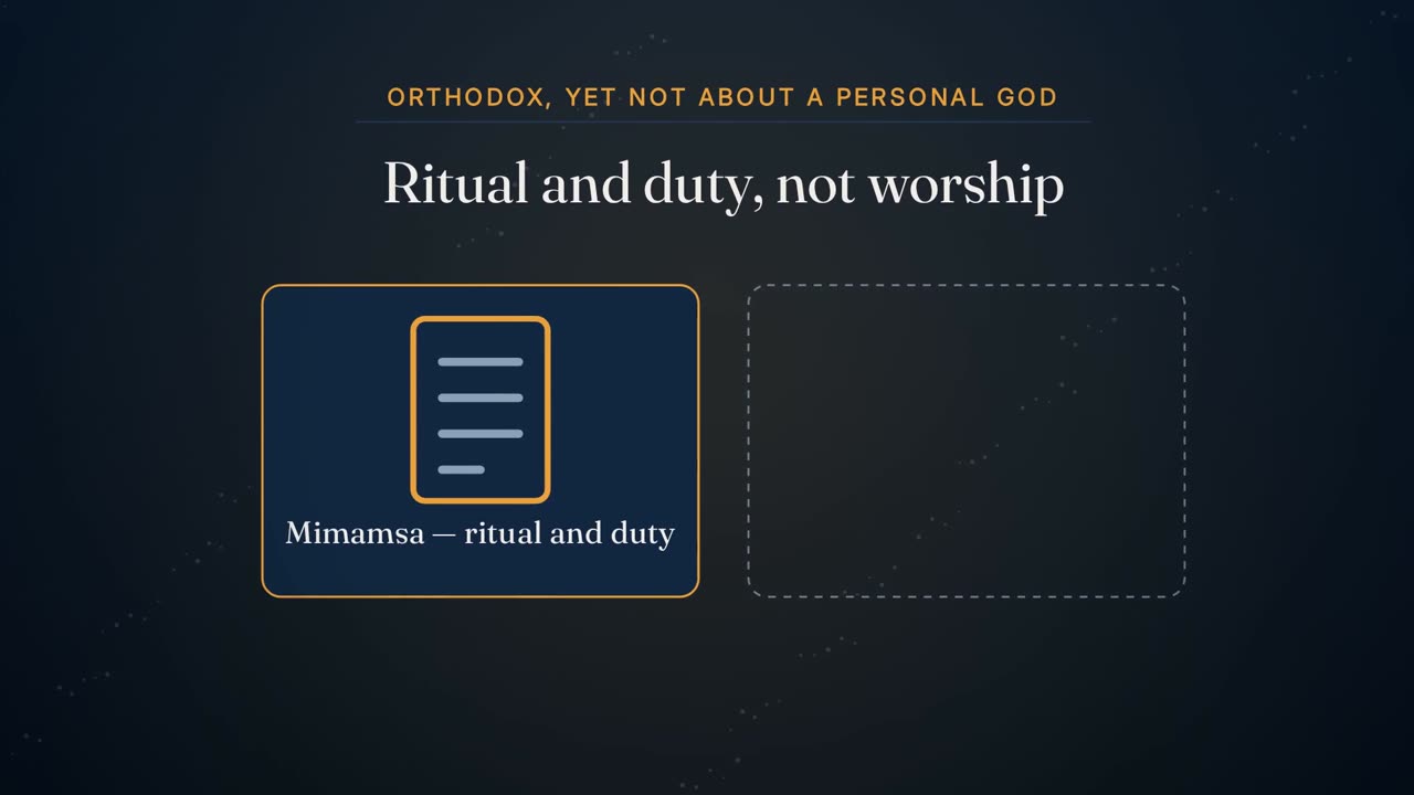
11:57 — 'Mimamsa: ritual and duty' and 'Not a personal deity'.
10

Icon card

An icon above a label, on a rounded panel

The card is the drawn scenes' basic unit: a panel in the chapter's panel colour, a rounded outline in the accent that flashes wider as it lands, an icon from the fixed vocabulary at 40% of its height and a label beneath. It scales in from 88% with a small overshoot, so it reads as placed rather than faded up.

Anatomy
  • Panel radius 24 px; outline 3 px accent, up to 6.4 px during its pulse
  • Icon scale = the smaller of width and height / 260
  • Label: display 600, fitted to card width minus 44 px, 40 to 22 px
Rules
  • One icon, one label
  • An icon name the vocabulary does not have falls back to the spark
The mortarboard icon in the course-overview cutaway.
11

Icon vocabulary

Seventeen plain line-and-fill icons, and nothing else

The drawings are data: a scene names a shape and a handful of icons from a small fixed set, and the renderer draws them. The set is small on purpose — a dozen-odd shapes that are unmistakable at a glance beat fifty that need a caption. Every icon draws inside a 200 x 200 box around its own centre, so any icon fits any slot, and none contains lettering. Nothing in the set can draw a logo, a chart, a document with readable writing, or anything that could be taken for a real organisation.

Anatomy
  • person, people (one lit figure between two dim ones), box, shelf, factory, doc (ruled lines, no text), coin, gear, clock
  • shield (with a tick), handshake, ladder, target, balance (scales), warn (triangle), cap (mortarboard), spark (eight-point star)
  • Figures: a circle head over a rounded body — reads clearly at any size
  • Colours: the icon takes the accent (or second accent) with panel, line and dim tones for its other faces
Rules
  • No lettering, logos, charts or real entities
  • Unknown names fall back to the spark
12:10 — 'some of the subtlest ethical and metaphysical systems the world has seen'.
12

Consequence pill

A short line tied to the central idea by a dashed leader

In a focus scene the supporting point is a label: one short line on a rounded panel with an accent outline, joined to the icon by a dashed leader, fading in on the phrase that introduces it. Labels are measured to their own text, so a short point gets a short label, and a label beside the icon is placed a fixed distance off the icon's edge however long it is.

Anatomy
  • Height 64 px (more for a large label); width = text + 48 px; text fitted from 40 to 22 px, up to 640 px wide beside the icon and 1200 px below it
  • Leader: 2 px dashed (7 px) in the line colour, from the icon's edge to the near edge of the label
  • Entrance: 0.45 s fade
Rules
  • Arrives on its own phrase
  • One short line — never a sentence with a clause
The drawn ground: gradient, dot field and centre glow.
13

Ground

Gradient, drifting dots, a soft glow and a vignette

Behind every drawn scene is the same ground: a vertical gradient between the style's two background tones, a slow field of 120 dots that drift without ever giving the eye anything to read, a soft accent glow high in the centre, and a vignette at the edges. Everything is drawn in the course's own style tokens so a cutaway sits in the same world as the deck around it.

Anatomy
  • Gradient bg to bg2
  • 120 dots, radius 1.6-3.1 px, dim colour at 22% on dark chapters and 14% on light, drifting up to 13 px across and 9 px down
  • Glow: radial at (960, 470), 80 to 1050 px, 13% accent
  • Vignette: clear to 520 px, 26% black at 1160 px
Rules
  • Nothing in the ground is legible
  • The ground is never a photograph
6:04 — the Greek and Sanskrit words, held against each other on a slow drift.
14

Camera move

One slow move per clip — a push, a pull or a drift

Each drawn scene gets exactly one camera move, eased with a smoothstep across the whole clip so it starts and ends at rest: a push in from 100% to 106%, a pull back from 106% to 100%, or a drift, which adds a 46 px sideways slide to the push. The move is applied to the scene, never to the caption band on top. In the lecture below eleven drawn scenes push and eight drift.

Anatomy
  • Scale about the frame centre; smoothstep ease t x t x (3 - 2t)
  • Drift: -23 px to +23 px horizontally over the clip
  • Applied inside the vignette, outside the ground
Rules
  • One move per clip
  • The caption band never moves with the scene
A drawn cutaway inside a light chapter, drawn on the light palette.
15

Dual-tone palette

The scene follows the chapter's light or dark palette

A drawn cutaway takes the course's typefaces and both of its palettes and follows the chapter it lands in: a cutaway inside a light chapter is drawn light, inside a dark chapter dark, blended over the same 0.8 s at a chapter boundary as the deck. Before this, drawn cutaways carried a palette of their own, which meant a lecture built in a white style cut away to a navy one.

Anatomy
  • Tokens used: bg, bg2, ink, dim, line, panel, accent, accent2
  • Display and UI faces from the style; a face that fails to load falls back to its generic family
  • Light or dark decided by the chapter the cutaway sits in
Rules
  • Same style as the lecture, always
  • The palette mix is driven by the lecture clock, not the clip clock
The film cutting away to a drawn scene and back, captions unbroken.
16

Caption band over the cutaway

The words keep running while the picture changes

A cutaway replaces the whole frame, and the caption band goes back over the top of it, drawn frame by frame by the same renderer that draws the band everywhere else — so the word highlighting carries straight through the cut and the student following the text never loses their place. Over a cutaway the band is always light-on-dark: white words on a graded scrim that rises from the foot of the frame, with the current word on its accent block.

Anatomy
  • Scrim: transparent at y 820 to 66% black at y 1080
  • Words: white, upcoming words at 40%; current word dark (#0B0B0C), weight 800, on the accent block
  • Same phrase, size and position as the band either side of the cut
Rules
  • The narration is never touched — only the picture changes
  • Captions are identical either side of the cut

Rules

The rules, and the reason for each.

Hard rules are checked by the engine and stop delivery if they fail. Guides steer the choice but can give way when the lecture needs it.

TypeRuleWhy
HardCut on phrase boundaries, never mid-word.A cutaway that starts or ends inside a word is the most noticeable defect this effect can ship with; the plan checks every edge against the phrase list.
GuideDrawn cutaways have their own quota: one a minute.They are free and cannot fabricate, so they should never compete with paid, generated clips for the same seconds.
HardDrawn cutaways may hold at most 14% of the runtime.A cutaway is punctuation, not a scene. The ceiling rose from 10% when settled text became a fault the planner has to fix rather than merely report: a drawn cutaway costs nothing and cannot fabricate, which makes it the safest thing to put over a slide that has stopped moving.
HardWhere the animated lecture holds the frame alone and has stopped changing, and the presenter budget cannot reach it, a cutaway is placed over the quiet stretch — drawn, where nothing in the passage can honestly be photographed.It is the last line of defence against a slide of words sitting on screen while the lecturer talks over it.
HardReal entities and document-like subjects are drawn, never generated.A generated picture of a real company, institution or public figure, or of anything that reads as a chart, statistic or headline, is a fabrication.
HardA stretch too abstract to photograph gets a drawing, not a forced photograph.'No photograph belongs here' is not 'no picture belongs here'. A drawing can carry a roadmap or a definition honestly.
HardFirst picture by 90 s; never 60 s without one.A student decides in the first minute what kind of video this is, and an average of one a minute can still hide a two-minute hole.
HardNo cutaway in the first 15 s or the last 25 s.The lecture opens and closes on the presenter.
HardNo cutaway over a definition, quote or hero.Those are the moments the deck was written for.
HardNo two cutaways overlap, and starts are at least 6 s apart.Back-to-back pictures read as a slideshow, not emphasis.
HardNever the same treatment twice in a row.Repeating one move reads as a template; varying it reads as editing.
GuideMatch the treatment to what the phrase is doing.An enumeration wants a build; a single culminating idea wants a push; a dense caption wants stillness.
HardEvery part lands on the word that introduces it.The same rule as the deck: nothing appears before it is said.
HardA scene's anchor phrase must be found, or the build stops.A cue that silently misses would land a card at the wrong moment.
HardOne camera move per clip, eased to rest at both ends.Two moves, or a move that starts abruptly, makes the cut itself jump.
HardNo lettering inside icons; no logos, charts or real organisations.The only words in a drawn scene are the kicker, headline and labels written for it.
HardThe drawing never comes within 88 px of the headline, and never runs into the caption band.A label sitting on the title reads as one tangled line, and the student cannot tell which words are the point and which the heading. The band below the drawing belongs to the captions, which are laid over every cutaway.
HardNothing is drawn above the focus icon.Above the icon is the headline. Labels go beside and below it, so the eye reads title, idea, consequence from top to bottom.
HardThe cutaway takes the course's style and the chapter's light or dark palette.A cutaway in a foreign palette reads as an insert from another film.
HardThe caption band is redrawn over every cutaway.A picture that replaces the frame should not also take the words away; the student following the text would lose their place exactly when the screen changes.
HardThe narration is never altered by a cutaway.A teaching visual changes only the picture.
HardEvery cutaway is named by its own start time, never by its position in a list.Position names shift when the plan changes and fail silently by opening another cutaway's clip.
GuideScenes can be withheld by hand, with the reason recorded.Some subjects — a real death, a real act of violence — are not illustrated at all.

Settings

Every setting, with its value.

These are the values the engine runs with today. The name in small type is the setting as it appears in the engine, for anyone comparing notes with a producer.

SettingValueWhat it does
Drawn cutaways per minuteANIM_PER_MIN1.0Target count; a 22-minute lecture aims for 22.
Drawn screen-time ceilingDRAWN_HI14% of runtimeHard cap on seconds of drawn cutaway, raised from 10% to cover settled text.
Ideal clip lengthCLIP_IDEAL5.0 sWindows near this length are preferred.
Longest clip (ordinary passes)CLIP_MAX6.5 sCandidate pool admits up to 7.5 s; only the gap pass may use the extra second.
Shortest window2.8 sBelow this a cutaway is a flicker.
Clear head and tailHEAD_CLEAR / TAIL_CLEAR15 s / 25 sNo cutaway at the very start or end.
Layout-edge clearance1.0 sA cutaway may not start or end this close to a layout change.
Start spacing6 s (9 s in the strict pass)Minimum time between two cutaway starts.
Density cap14 per 120 s (12 in the strict pass)Keeps cutaways from bunching.
First pictureOPENING_MAX90 sHard check.
Longest stretch without a pictureMAX_GAP60 sHard check, measured only where a cutaway is allowed.
Treatment for listsProgressive Build-OnFirst choice when the phrase lists, sequences or compares.
Treatment for short clipsPan & Zoom under 6 sSecond rule in the rotation.
Treatment over captionsFloating & Pulsing GlowWhen the base layout is Presenter + Captions.
Camera pushmove1.00 to 1.06 (pull: 1.06 to 1.00)Scale change across the clip, smoothstep eased.
Driftmove46 px sideways plus the pushThe drift move.
Card entrance0.42 s (0.45 s for versus sides and focus pills)How long a part takes to land.
Anchor search start4.5 s before the clipHow far back a scene's phrase lookup begins.
Focus breathing3% at 1.4 rad/sThe glow and centre icon's ambient pulse.
Frame rate and qualityFPS30 fps, constant quality 18Clips are encoded at master quality.
Minimum valid clip10 KBSmaller files are treated as missing and redrawn, or fall back.
Illustration headroom (reference treatments)BW, BH2304 x 12961.2x the frame, so camera moves never run out of picture.
Title clearanceLAYOUT.gap88 pxThe least clear space between the lowest ink of the headline and the top of anything drawn under it.
Lowest drawing edgeLAYOUT.bottomy 796Nothing is drawn below this line: the caption band's shade starts at y 820, and the camera's 6% push has to fit in between.
Kicker and headline positionsLAYOUT.kickY / headYy 156 / y 268 (232 without a kicker)Where the title block sits; the drawing is then centred in the space between it and the lowest drawing edge.
Headline widthLAYOUT.headW1480 pxThe widest a headline may be set before it is made smaller, leaving room for the camera push at the frame edges.
Focus icon sizeradius 150 px, down to 90 pxThe icon shrinks when a scene is short of space, before any label is allowed to crowd the title or the caption band.

Checks

What is verified before it ships.

Title clearance, measured on every clip

Before a drawn cutaway is encoded, the renderer reports the real gap between the headline and the drawing and the lowest point of the drawing. A clip with less than 88 px under the headline, or a drawing below y 796, is refused and the build stops, so a cramped frame cannot reach a lecture. In the lecture on this page all 19 clips clear the headline by 88 to 95 px and end at or above y 796.

Edges on phrase boundaries

Every cutaway's start and end must match a caption-phrase boundary to within 0.01 s.

No overlaps

Each cutaway must end at or before the next one starts.

Drawn share

Drawn seconds must stay within 14% of the runtime (with half a second's tolerance).

Distribution

First picture by 90 s and no stretch over 60 s without one; a build that cannot meet either stops and names the stretch.

No repeated treatment

No two consecutive drawn cutaways share a treatment.

Entity gate re-checked

After placement, every non-drawn cutaway is re-checked for real entities; anything that names one must be drawn.

Every drawn cutaway has a scene

A drawn cutaway with no scene is reported before rendering, and would otherwise fall back to the layout underneath.

Cues inside the clip

Any part whose phrase lands after the clip ends is flagged when the scenes are resolved.

Assembly record

The assembler records, for every cutaway id, which clip it used or that it fell back — so a missing drawing is visible, not silent.

Pieces match their inputs

Each assembled piece records the clip and caption data it was drawn from; a changed input forces a rebuild.

Worked example

In a real lecture

In the 22-minute Indian philosophy lecture, the plan placed 50 cutaways: 22 generated stills, 9 generated clips and 19 drawn. The drawn ones hold 95.4 s, 7.1% of the runtime, against a ceiling of 134 s; their target of 22 was not reached, and the plan reports that shortfall as advisory rather than forcing three more into windows the spacing rules had closed.

Why they were drawn is recorded for each. Ten were placed by the gap pass, in stretches too abstract for the ordinary candidate pool — 'the questions keeping him awake are older than he knows', 'around 800 to 500 BCE'. Seven were drawn by selection in the ordinary rotation. Two had to be drawn because the sentence named a real entity ('the great Indian thinkers', 'the president of the Republic of India').

The first drawn cutaway lands at 0:30, inside the opening presenter-and-captions stretch. Ten sit over the full-frame deck, seven over the presenter beside the slide and two over the caption layout. Treatments: Pan & Zoom eight times, Parallax six, Progressive Build-On three, Floating & Pulsing Glow twice, never the same twice running. Shapes: thirteen focus scenes, five rows and one versus; eleven push and eight drift.

All nineteen were drawn and cut in; the assembly record shows no fallbacks. They run from 3.04 s to 7.2 s.

19 of 50Drawn cutaways
95.4 s (7.1%)Drawn screen time
0:30First drawn cutaway
10Placed by the gap pass
8 / 6 / 3 / 2Treatments
13 focus, 5 row, 1 versusShapes
3.04-7.2 sClip lengths
0Fallbacks

Limits

What it deliberately does not do.

  • It does not generate imagery and does not attempt photorealism; figures are a circle head on a rounded body.
  • It draws only from its fixed shapes and icon set. An idea that needs a specific object the set does not have is carried by the words and a general icon.
  • It never draws logos, charts, readable documents or real organisations, and it does not illustrate real deaths or violence — those scenes are withheld by hand.
  • It does not re-time the narration or cut the audio; only the picture changes.
  • Corner radius and motion in drawn scenes are the renderer's own; palette and typefaces come from the style.
  • A treatment is recorded per cutaway and rotated, but the drawn-scene renderer expresses motion through one camera move and the word-cued build, not four separate animation engines.
  • If the plan finds no legal window in a stretch, the stretch is reported rather than forced.

Works with

How it meets the other effects.

Questions

What educators ask about it.

Why drawn rather than generated?

Because much of a lecture cannot honestly be photographed. A drawing can carry a definition or a roadmap without inventing a person, a place or a document, and it costs nothing to make.

How does it decide what to draw?

The plan decides where; a short scene description for the lecture decides what: a shape, a headline, and a few icons and lines, each tied to the phrase that introduces it.

Will it match our course's look?

Yes. Each drawn cutaway uses the course's template style — its typefaces and both palettes — and follows the light or dark palette of the chapter it lands in.

Do the captions disappear during a cutaway?

No. The caption band is drawn back over the top of every cutaway, so the words and the word highlighting run straight through.

Can we stop a subject being illustrated?

Yes. Any cutaway can be withheld by hand with its reason recorded; the lecture then stays on its own view for that phrase.

Are the four treatments four different animations?

They are four motion ideas the plan assigns and rotates. In the renderer used today every drawn scene builds its parts on their words, and each clip carries one slow camera move — a push, a pull or a drift — chosen for that scene.

All effects

Every effect has a page like this one.

See this effect on your own lecture.

Send a recording and we'll run it through the pipeline as a pilot — one free sample per institution.