Engine/Effects/Animated Lecture

Animated Lecture

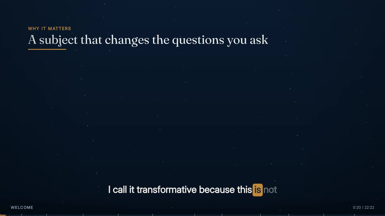
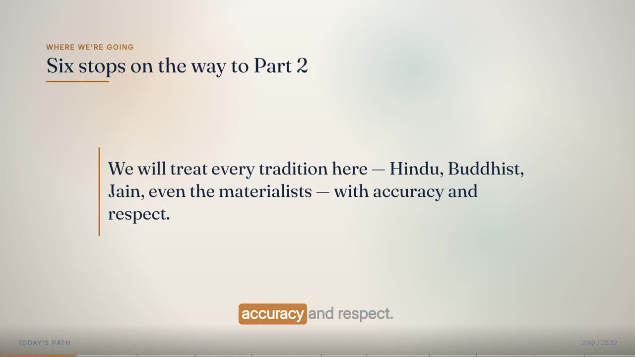
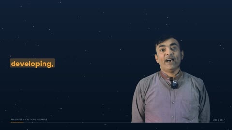
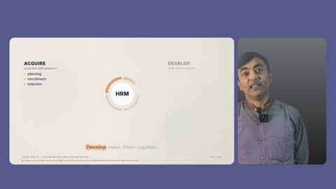
The whole lecture redrawn as motion graphics, driven by the recording's own words. Every heading, list, diagram and number arrives on the word that introduces it, the phrase being spoken runs underneath with the current word lit, and nothing appears on screen before it has been said.

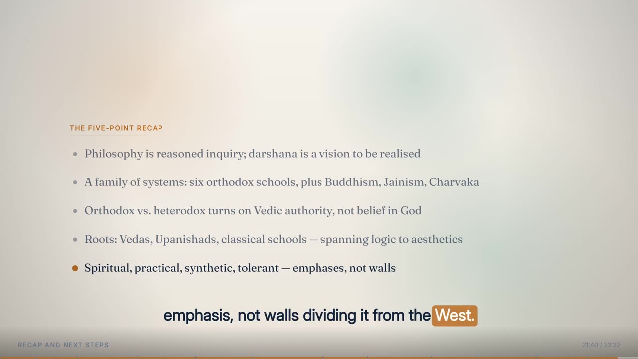
29 elements · word-cued · dual-tone

The finished effect

What it looks like when it is done.

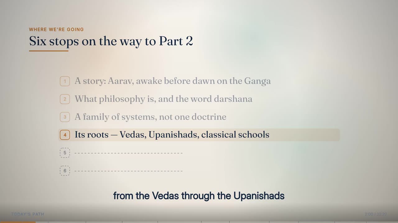
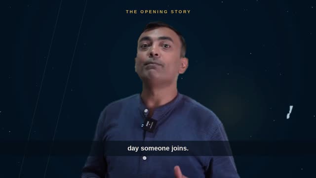
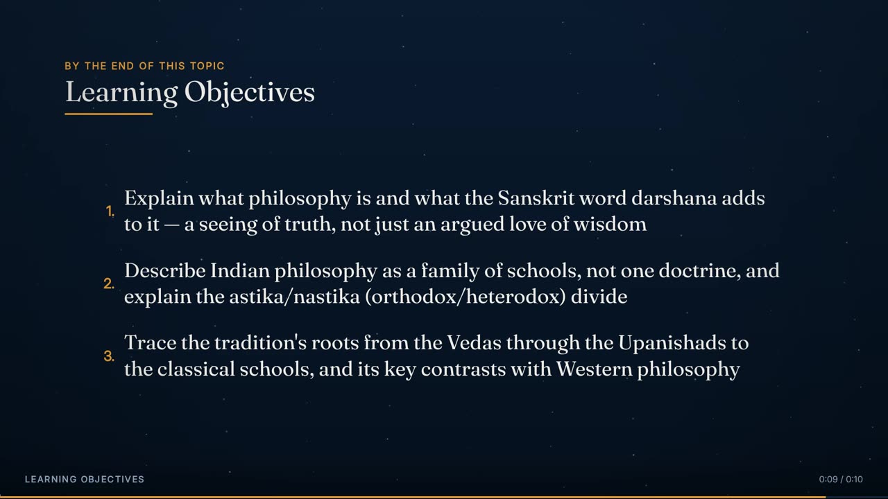
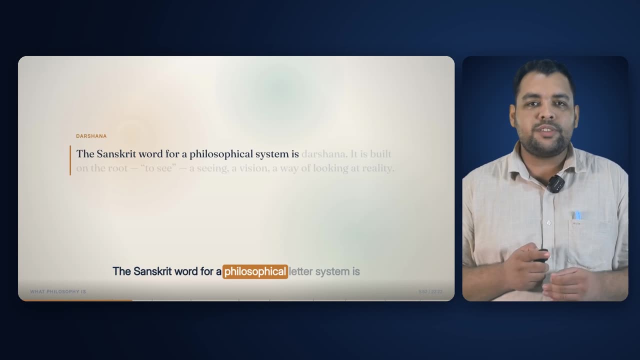
Forty-six seconds of the 22-minute Indian Wisdom lecture used throughout this page (0:53 to 1:39 of the lecture) in the Full Animated Lecture layout: the presenter's voice carries on while the screen is given over entirely to the drawn slide, each point arriving on the phrase that introduces it and the caption band running underneath.

46 s · 1920 × 1080 · with sound

Overview

What it is, and why it exists.

The animated lecture is the deck the rest of the film is built around. It is rendered for the full length of the lecture and then used twice: as the full-frame Animated Lecture layout, and scaled into the slide card beside the presenter in the Presenter + Animated layout. In the 22-minute lecture used throughout these pages it holds the full frame for about two thirds of the runtime.

It solves the problem of a recorded lecture that is only a talking head. Rather than extracting slides, the engine composes a deck for the lecture: chapter headlines that summarise what the speaker is doing, lists in full clauses, definitions that light their key words as they are read, comparisons, sequences and diagrams. Each item is bound to a phrase in the transcript, not to a time, so it cannot drift from the word it belongs to.

It depends on three things made earlier in the pipeline: the cleaned, word-timed transcript (every word with a start and end on the cleaned timeline), the loudness envelope of the studio audio, and the course's template style. It sits after cleanup and studio sound and before composition, which decides where the deck is shown full-frame, where it sits beside the presenter, and where it is cut away from.

The one rule it never breaks: at every frame, what is on screen corresponds to what is being said at that instant. If the speaker departs from his script, the audio wins; the script is a spelling reference, not a timing source.

29 (25 in the deck, 4 drawn-cutaway shapes)Element types
1920 x 1080, 30 fpsFrame
a transcript phrase, never a clock timeCue source
0.22-0.55 s by style (Scholar 0.45 s)Entrance
0.8 s blend at every chapterPalette change
up to 9 words, centred at y 950Caption band
60 s, then a presenter cutLongest full-frame hold
any pause over 0.75 sSilence beat

How it is made

Step by step, in the order the engine runs it.

Build the word timeline

Speech recognition transcribes the cleaned audio in chunks of about 24 s cut at natural pauses, merges sub-word pieces into words, and clamps each word's end to the next word's start. The words are re-timed onto the cleaned timeline, spelling repairs from the lecturer's own script are applied, and the words are grouped into caption phrases. Nothing downstream re-times a word.

Take the loudness envelope

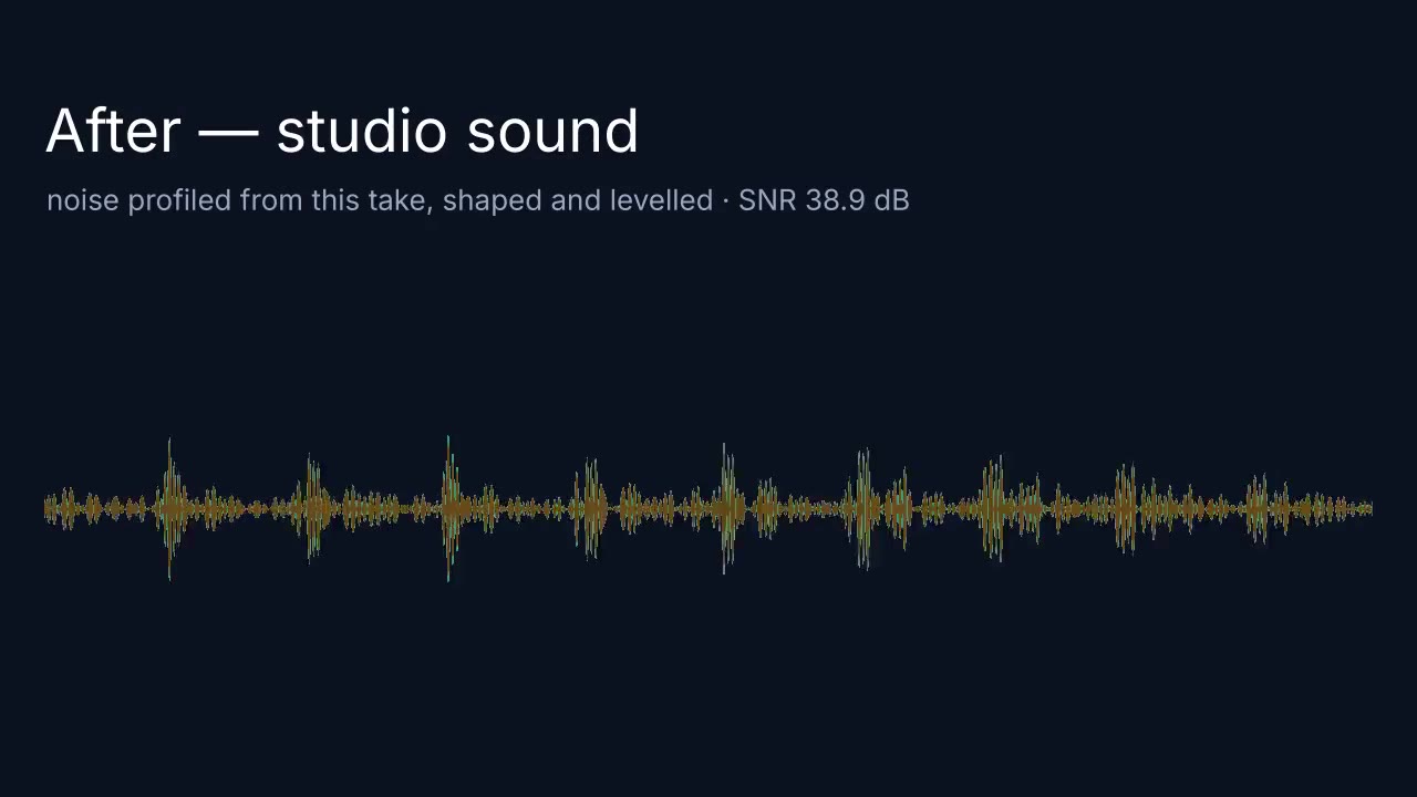
The studio audio is measured in a 55 ms window at 30 fps, normalised to the 92nd percentile of speaking frames and smoothed with a fast attack and slow release. This per-frame curve later scales every pulse, so the screen leans when the lecturer leans on a word.

Compose the deck

The deck is the one authored file in a job. It divides the lecture into chapters, marks each light or dark, and lists the elements for each: type, box, content, and for every part the phrase that introduces it. Headlines are written as summaries, not substrings of the transcript; anchors quote what was actually said, including the recogniser's spelling of an unfamiliar word, because that is what the phrase lookup has to find.

Resolve every cue to a word

Each anchor phrase is found in the transcript, searching forward from the previous cue so repeats resolve to the right occurrence. A phrase that cannot be found stops the build and names the phrase; a mistyped cue can never silently drift. An element's end is the start of its closing phrase minus 0.02 s, or the end of its chapter.

Check the deck before rendering

The deck check refuses any element that ends before it starts, any item cued outside its element's window, and any two elements that are on screen together in the same chapter and share part of their boxes. It reports the number of cue points, the changes per minute and the longest hold with nothing new on screen.

Resolve the style

The course's template style is read from the lecture's settings. Its two typefaces are loaded before the first frame is drawn — a style that names a face the job does not have fails at once rather than rendering thousands of frames in a fallback font — and any pictures are decoded before the first frame is asked for.

Render each frame deterministically

Each frame is a pure function of its time: ground (at 40% speed), content layer, vignette, caption band, then chrome, on a single 1920 x 1080 canvas. No free-running animation and no unseeded randomness, so any frame can be re-rendered identically. Frames are taken five at a time as high-quality stills and encoded in resumable chunks of 900 frames, each marked done when finished, so an interrupted render resumes rather than restarts.

Hand it to composition

The finished deck covers the whole runtime. The composition plan cuts it into full-frame runs of at most 60 s, places it in the slide card beside the presenter elsewhere, gives any stretch where the deck has nothing new to the presenter, and protects its definitions, quotes and heroes from cutaways.

Elements

Everything this effect puts on screen, one piece at a time.

Each element below is shown as the engine actually produced it, in the real lecture, with its parts, and the rules that govern it.

A hero opening a chapter: kicker first, then the title.
01

hero

Opens a chapter: kicker, then one big title

The hero is the chapter's front door. A small tracked kicker appears first, centred, and the title arrives on its own cue a beat later, so the eye lands on the small line and then drops to the big one. If the title's cue has not been reached yet, the space it will fill is held by a dashed placeholder rather than left empty. Because a hero is one of the moments the deck is written for, the composition planner protects it: no cutaway of any kind may be placed over a hero while it is on screen. In the real lecture below, eleven of the sixty-one elements are heroes, one per chapter except the first.

Anatomy
  • Box used in practice: 260,350 at 1400x360 px
  • Kicker: UI face, weight 700, 22 px, tracked 3.4 px, accent colour, centred on the box
  • Title: display face 700, auto-fitted from 96 px down to 34 px (line height 1.16), centred at 58% of the box height
  • Entrance: the style's entrance curve stretched by 1.11; title rises 16 px as it lands
  • Before the title cue: dashed outline (7 px dash) over 76% of the box width, 52% of its height
Rules
  • Kicker and title each carry their own cue; the title never appears before its words
  • Protected set piece: cutaways may not overlap it
  • Title text is fitted once to the box, never allowed to overflow
A header holding top-left while the chapter's body builds beneath it.
02

header

Names the chapter and stays while the body changes

A header sits top-left and holds for the length of a chapter section, so the viewer always knows where they are while the body underneath keeps changing. It is a kicker, a composed headline (a summary of what the speaker is doing, not a quotation of what he said) and a short accent rule that draws out from the left as the header arrives. It is the only element designed to share the screen for a long time with other elements, which is why its box sits above every other box in the grid.

Anatomy
  • Box: 140,150 at 1240x180 px — the highest box in the frame; nothing is drawn above about y 120
  • Kicker: UI 700, 21 px, tracking = style tracking + 0.4 px, accent
  • Headline: display 700, fitted 62 px down to 30 px, line height 1.14, top-left aligned
  • Rule: 4 px accent line, grows to 190 px wide in step with the entrance
Rules
  • Headline is written for the chapter, never lifted verbatim from the transcript
  • Holds until its closing anchor phrase; everything else in the chapter sits under it
Bullets arriving as they are spoken, the current line lit.
03

bullets

A list that arrives line by line as it is spoken

Bullets put one line on screen per spoken point. A line does not exist until its anchor phrase is said; lines still to come are not drawn at all, so the list fills in step with the voice. The line being spoken is lit (full ink, a larger marker); lines already said stay at 62% opacity. When the list has a settle time, every line comes up to full once the last has landed, because at that point there is no longer a current line and the card is simply a set of statements. Lines can be numbered or dotted, and one phrase inside a line can be named as its hot word and drawn in the accent colour.

Anatomy
  • Box: 210,420 at 1500x430 px; rows are the box height divided by the item count
  • Marker: dot of 9 px radius when live, 6 px when passed (accent / dim); or a right-aligned number up to 30 px
  • Text: display 600, fitted from 44 px (or a set size, 34 px on the five-point recap) down to 22 px
  • Passed lines: 62% opacity; entrance lift 75% of the style's rise
Rules
  • No line is drawn before its anchor word
  • Only one line is 'current' at a time
  • If the first item's cue lands more than 2 s after the element's own cue, the element is pulled forward to 1 s before the first item so the frame is never an empty kicker
Cards filling their dashed slots one by one.
04

cards

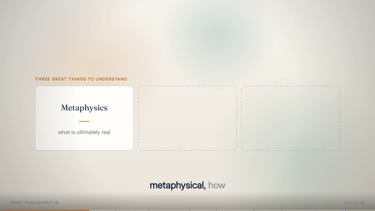
Two to four panels, each a title with a consequence under it

Cards set two to four ideas side by side, each with a short title and a supporting line under a small accent rule. Every slot is visible as a dashed outline from the moment the element appears, so the viewer can see how many things are coming before any of them are named. As each card's word is spoken it rises into place, its border flashes accent and settles back to the line colour over 0.9 s. The flash is scaled by how hard the speaker leaned on the word.

Anatomy
  • Box: 180,440 at 1560x330 px; 26 px gap; width shared equally
  • Title: display 700, fitted 42 to 22 px inside 42% of the card height, centred at 34%
  • Sub line: UI 500, fitted 28 to 17 px, dim colour, centred at 72%; a 52 px accent rule at 55%
  • Ghost: 2 px dashed outline (8 px dash) at 50% opacity
  • Corner radius: 20 px x the style's radius factor
Rules
  • All slots appear as ghosts first
  • Pulse lasts 0.9 s and is multiplied by 0.72 + 0.5 x emphasis
  • Text is fitted against the card's final content so type size never changes as cards arrive
A row of chips standing as ghosts, then filling as each term is spoken.
05

chips

Slots that fill as each item is named

Chips are the lightest list: a row (or column) of equal boxes, each holding one short term. They stand as dashed ghosts the moment a sentence promises several of something, and each fills as it is named. In the lecture below the opening chapter uses a row of five chips — Dharma, Karma, Moksha, The self, The good life — each cued to the speaker's own pronunciation of the word.

Anatomy
  • Box: 200,470 at 1520x220 px; 18 px gap; horizontal or vertical
  • Chip text: display 600, fitted 40 to 20 px, centred
  • Arrival pulse: border goes accent for 0.8 s, width 2 + 2.4 x pulse
  • Ghost: 2.2 px dashed dim outline at 85% opacity
Rules
  • Each chip is cued to the word that names it, as the speaker actually said it
  • Terms only — a chip never carries a sentence
A definition filling in as it is read, the key word lit.
06

define

A definition that fills in word by word as it is read

Define lays out a definition word by word rather than line by line. The whole text is placed from the first frame so nothing reflows under the reader's eye, but words not yet spoken are held at 16% opacity. As the speaker reaches them they come up to full ink, and the load-bearing words are lit in the accent colour, set heavier, with a soft accent block behind them whose strength follows the speaker's emphasis. A term label sits above in tracked capitals and an accent bar runs down the left edge. Definitions are protected set pieces: no cutaway may cover one.

Anatomy
  • Box: 230,360 at 1460x450 px
  • Term: UI 700, 21 px, upper case, accent
  • Accent bar: 5 px, full height of the text block
  • Text: display 600 (700 for lit words), stepped from 46 px down to 22 px in 2 px steps until it fits; line height 1.34
  • Unspoken words: 16% opacity; lit-word block at 16% accent, scaled by emphasis
Rules
  • No lift on the words: a two-pixel rise over a second is sub-pixel crawl, so words change opacity in place
  • Protected set piece — cutaways may not land on it
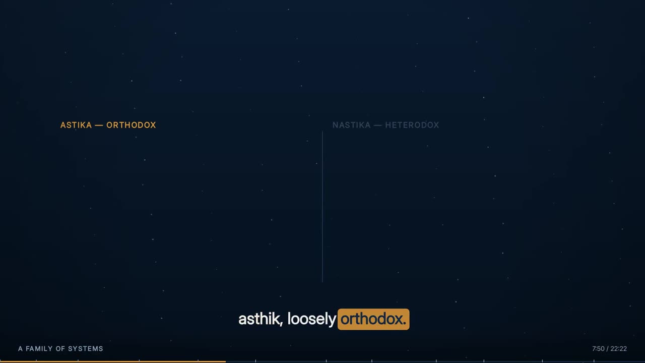
Two columns: headings dim until the argument reaches them.
07

columns

Two or three ideas held against each other

Columns carry a comparison. Each column has a heading in tracked capitals and a list of points beneath it, with a thin rule between columns. The heading sits dim (32% opacity) until the argument reaches that side, so the shape of the comparison is visible before it is filled; items then arrive one by one on their own words. In the lecture below, columns carried Greek philosophy against Indian darshana, and the orthodox schools against the heterodox ones.

Anatomy
  • Box: 180,380 at 1560x470 px; 60 px gap between columns; 2 px divider in the line colour
  • Heading: UI 700, 23 px, upper case, accent once reached, dim before
  • Rows: up to 74 px each; 5 px accent dot; text display 600 fitted 36 to 20 px
Rules
  • A column heading lights only when the speaker reaches that side
  • Items appear on their own anchor words, never all at once
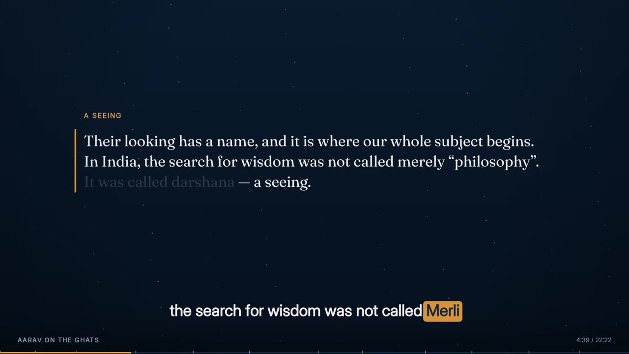
A quote set against its accent rule.
08

quote

A sentence worth stopping on

A quote sets one sentence large against a vertical accent rule with nothing else in the body. It is used for a line the lecture wants to hang on — a closing thought, a line somebody else wrote. Because it is one of the moments the deck is written for, it is a protected set piece: the composition planner will not place a cutaway over it. Seven of the sixty-one elements in the lecture below are quotes.

Anatomy
  • Box: 300,440 at 1320x280 px
  • Rule: 4 px accent line down the left edge, inset 6 px
  • Text: display 600, fitted 54 to 24 px, line height 1.26, left aligned 26 px from the rule
  • Entrance: style curve x 1.11, 75% of the style's rise
Rules
  • Nothing else shares the body while a quote is up
  • Protected set piece — cutaways may not overlap it
A slam with its hot phrase turning accent.
09

slam

One line, full width, the strongest register

A slam is a whole sentence across the frame in the largest type the deck uses. One phrase inside it can be named as its hot word; that phrase turns to the accent colour on the word that carries it (or immediately). An optional sub line arrives under it on its own cue. Slams are the most-used element in the lecture below — fifteen of sixty-one — because a lecture's key claims are usually single sentences.

Anatomy
  • Box: 220,360 at 1480x400 px
  • Text: display 700, fitted 104 px down to 40 px, line height 1.18, centred
  • Hot phrase: accent colour, drawn inline in three runs so the line does not shift
  • Sub: UI 500, 34 px, dim, at 82% of the box height, rises 12 px
Rules
  • The hot phrase lights on its cue, not before
  • A slam is one sentence — never a paragraph
A chain with each arrow drawing just ahead of its node.
10

chain

A sequence of steps with arrows that draw themselves

A chain is a row of linked panels for anything that happens in an order. Each node is a dashed ghost until its word; then it rises in with an accent border pulse. The arrow between two nodes draws itself starting 0.35 s before the next node lands, so the arrow leads the eye to where the next idea is about to appear. In the lecture below a chain carried the Vedantic staircase — hearing, reasoning, realising.

Anatomy
  • Box: 200,480 at 1520x180 px; 74 px gap holds the arrow
  • Node text: display 600, fitted 44 to 22 px; radius 22 px x style factor
  • Arrow: 3 px, second accent colour; grows from a 12% stub over 0.45 s; arrowhead (13 x 16 px) once 60% drawn; opacity 25% to 100%
Rules
  • An arrow never completes before the node it points at is about to arrive
  • Nodes are ghosts until named
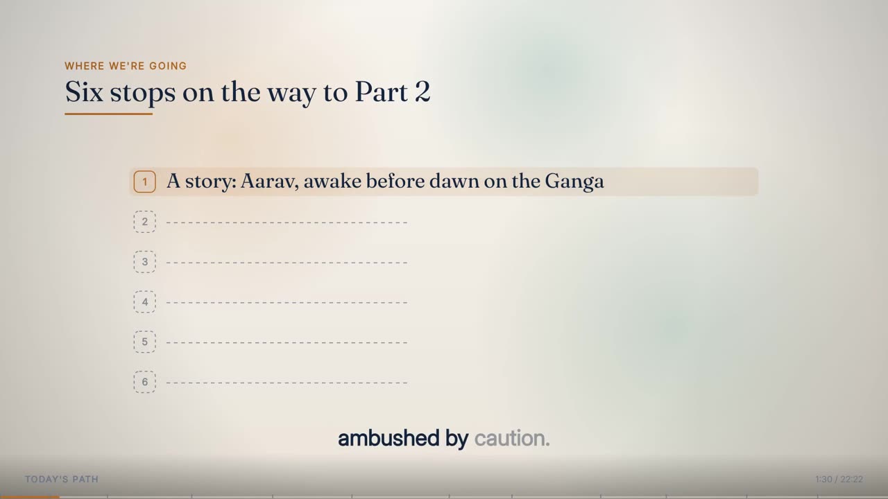
The rail: current stop banded, passed stops retired, future stops dashed.
11

rail

A numbered agenda with a moving marker

The rail is a vertical, numbered list for a roadmap the lecture returns to. Each row has a numbered badge; rows not yet reached show a dashed badge and a dashed line where the label will go; the current row is banded with a soft accent fill and its badge pulses; with retire switched on, rows already passed fall back to 42% opacity so the list reads as progress, not as a wall. The sample clip on this page is the lecture's six-stop rail.

Anatomy
  • Box: 290,350 at 1340x520 px; rows = height / items
  • Badge: up to 46 px square, radius 11 px x style factor; number in UI 700 at 46% of badge size
  • Current row band: accent at 14% x (0.72 + 0.5 x emphasis), 10 px beyond the box each side
  • Label: display 600, fitted 44 to 22 px, first line only; ghost line up to 520 px long, dashed 8 px
Rules
  • Passed items retire to 42% opacity
  • Only the current item carries the band and pulse
A counter rolling to its value with the rule growing beneath it.
12

counter

A number that counts up to its value as it is said

The counter is for a figure the lecture wants felt rather than read. It rolls from zero to its value across exactly the span of the words that say it, overshoots by up to 5% in the last 14% of the count and settles, while an accent rule grows out beneath it. A small tracked label names what is being counted. The count follows the same eased curve as every entrance in the style.

Anatomy
  • Figure: display 700, 118 px, accent, at 42% of the box height; optional suffix
  • Rule: 4 px accent, grows to 220 px wide in step with the count
  • Label: UI 700, 22 px, dim, tracked 4 px, at 88% of the box
  • Count window: from the first to the last word of the number, never shorter than 0.35 s
Rules
  • The number is never shown at its final value before it has been said
  • Overshoot is a scale of at most 1.05, then back to 1.0
The title slide assembling itself as the welcome is read.
13

titleslide

The card the lecture opens and closes on

The title slide is the card the welcome and closing note are read over. Everything on it arrives on the word that names it: the institution kicker, then the topic title, the programme and course rows, the presenter's portrait (cut out of their own recording) and last their name and role. It is drawn on the same blue stage the presenter stands on in every layout, with no chapter label, clock or progress bar, because a title card is not part of the lecture's length.

Anatomy
  • Left column from x 132, 950 px wide; kicker at y 214 with a 116 px accent rule; title fitted 74 to 34 px from y 292
  • Rows from y 640 (648 on this lecture), 82 px apart: 17 px label over a 31 px value
  • Portrait: 690-700 px tall, centred near x 1462-1480, feet at y 858-880, with a soft pool of light behind
  • Name: display 700, 46 px, 66 px below the portrait; role: UI 600, 22 px, tracked 2.4 px
Rules
  • Every part has its own cue
  • Card palette is fixed (ink #F2F5F9, accent #E8A03A) so the card matches the stage
  • No chrome on a title card
A timeline whose spine draws only as far as the lecture has reached.
14

timeline

An order, with dates on it

A timeline is a horizontal spine with a marker per event. The spine is drawn in the line colour; over it an accent line grows from the start toward the next marker as the lecture moves between events, so the line itself is the progress bar. Each marker lands with a ring that opens and fades, carries a short date or tag in the accent colour and a label above or below — alternating so long labels never collide.

Anatomy
  • Spine inset 56 px each end, at 52% of the box height; stroke = style stroke weight (+1 for the lit part)
  • Marker: 8 px accent dot with a 3 px ground-coloured edge; ring expands from 9 to 31 px over 0.7 s
  • Tag: UI 700, 19 px; label: display 600, fitted 27 to 15 px, width limited to twice the distance to the nearer edge
  • Unreached markers: 6 px dim ring at 50% opacity
Rules
  • Labels alternate up and down unless one is forced
  • The lit spine never runs ahead of the lecture
A matrix building header, labels, then tinted cells.
15

matrix

Every pair of two lists at once

A matrix sets rows against columns. The grid rules are drawn first, then the column headers, then the row labels, then each cell on its own cue — tinted by its verdict (good, bad, second accent or accent). Two lists side by side give a comparison; a grid gives the whole cross-product, which is a harder thing to say in words.

Anatomy
  • Label column: up to 300 px or 24% of the box; header row 54 px
  • Headers: UI 700, 17 px, upper case, tracked
  • Row labels: display 600, fitted 26 to 15 px
  • Cells: 14% tint of the verdict colour, value in display 700 fitted 30 to 14 px
Rules
  • Cells arrive on their own words, not all at once
  • Colour carries the verdict; the words carry the meaning
Bars growing from the baseline with their figures.
16

bars

How much, side by side

Bars grow out of a baseline and the figure above each rolls up with it, so the number reads as an amount rather than a caption. Bars not yet reached sit as dashed footprints on the baseline. The scale is set by the largest value plus 12% headroom unless a maximum is given.

Anatomy
  • Baseline 44 px above the box bottom; gap up to 46 px
  • Bar: rounded top (8 px x style factor), 90% opacity, tone colour
  • Value: display 700, 32 px, 10 px above the bar; label: UI 600 fitted 19 to 12 px under the baseline
  • Growth uses the entrance curve stretched by 1.6
Rules
  • The value shown always equals the bar's current height
  • Unreached bars are footprints, never missing
A proportion bar dividing into its shares.
17

proportion

Shares of one whole

Proportion is a single bar that divides. It is different from bars on purpose: bars compare separate quantities, this splits one thing, and the reading is 'of what is there, this much is X'. Each segment wipes in from its own left edge on its cue, with its percentage and label underneath.

Anatomy
  • Bar at 30% of the box height, up to 96 px tall, rounded 10 px x style factor
  • Segments alternate accent and second accent unless a tone is set, 86% opacity
  • Percentage: UI 700, 18 px; label: display 600 fitted 25 to 14 px
Rules
  • Shares are computed from the values given; percentages are rounded
  • Segments are clipped to the bar so nothing spills
A line whose path draws in the direction the sentence goes.
18

line

A trend, drawn rather than shown

Line draws a trend as a path that travels, because the drawing is the argument: the eye follows it in the direction the sentence is going. The path head is a dot that moves smoothly along the partial last leg rather than jumping point to point. Two series can run against each other, and a series can carry a soft fill under it and a label that rides with its head.

Anatomy
  • Plot inset 52 px sides, 18 px top, 46 px bottom; three hairline gridlines
  • Stroke: style stroke + 1.4 px, round joins
  • Draw time: 1.6 s by default, never under 0.5 s
  • Head: 7 px dot with a 3 px ground-coloured edge; optional 14% fill
Rules
  • The path reaches each point only when the lecture does
  • Axis labels are UI 600, 16 px, dim
Two circles scaling in, then the overlap named.
19

venn

What two or three ideas share

Venn scales circles in from their own centres, each filled at 20% of its colour with a solid outline, and names the overlap as its own beat. Labels sit outside their circles, pushed away from the middle. For a distinction the lecture wants to soften rather than sharpen.

Anatomy
  • Two or three circles; radius up to 40% of the box height
  • Circles grow from 86% to 100% of their size on entry
  • Labels: display 600 fitted 28 to 15 px; overlap text display 700 fitted 26 to 13 px
Rules
  • The overlap label arrives on its own cue, after the circles
  • At most three sets
A flow with a decision node and its branches drawing in.
20

flow

A concept with branches

Flow places nodes at positions the composer chooses, because a flow's shape is part of what it means and cannot be derived from a list. Steps are rounded boxes, decisions are diamonds, end points carry a heavier outline in the second accent. Edges draw with a travelling head and their labels fade in once the edge is 60% drawn.

Anatomy
  • Node: up to 300 x 110 px; radius 14 px x style factor
  • Edge: dim, style stroke weight; arrowhead once 98% drawn; label UI 700 15 px, tracked
  • Unarrived nodes: dashed outline at 42% opacity
Rules
  • Node positions are authored, not computed
  • An edge starts 0.25 s before the node it points at
A cycle whose arcs close the loop.
21

cycle

A process that comes back round

Cycle arranges its steps evenly on a circle, starting at the top, and sweeps an arc between each pair so the loop visibly closes — which a left-to-right chain cannot do. An optional centre label sits in the middle in the accent colour.

Anatomy
  • Radius up to 40% of the box height or 24% of its width
  • Node: up to 230 x 88 px
  • Arc: dim, stops 0.30 rad short of each node, arrowhead when complete
Rules
  • Each arc draws as the next node's cue approaches
  • The last arc returns to the first node
A stack building upward, every layer staying.
22

stack

Parts that build a whole, and stay

Stack builds layers upward from the bottom of its box, and none of them goes away. For a concept assembled out of parts, where the point is that the earlier parts are still holding it up. The top layer is outlined in the accent colour; each layer carries a 4 px tone bar on its left edge and an optional sub line.

Anatomy
  • Layer height up to 104 px, 10 px gap
  • Title: display 700 up to 30 px; sub: UI 500 up to 21 px, dim
  • Layers rise 34 px as they land
Rules
  • Layers never retire
  • Unarrived layers are dashed at 32% opacity
A formula whose operators arrive before its terms.
23

formula

An expression, term by term

Formula builds an expression left to right with the operators arriving first, so the shape of the expression is on screen before the parts are. Each term scales from 94% to full size as it lands, and a note can tick in under whichever term is being explained. The result, if there is one, arrives in the second accent colour.

Anatomy
  • Type: display 700 from 52 px, stepped down 2 px at a time until the whole expression fits
  • Operators: dim at 55% opacity
  • Note: 22 px accent leader line, UI 600 19 px text, arrives 0.45 s after its term
Rules
  • The expression is measured whole before any of it is drawn
  • Notes sit under their own term only
A picture with pins landing and labels drawing out.
24

annotate

A picture the lecture can point into

Annotate places a picture in a rounded frame and lands pins at chosen points on it, each drawing a leader line out to its label on a plate. A cutaway is a picture with a caption; this is a picture with the lecture's attention pointed into it.

Anatomy
  • Picture fills the box (cover crop), rounded 16 px x style factor
  • Pin: 7 px accent dot; leader grows 54 to 114 px
  • Label: display 600, 25 px, on an 88% panel plate 44 px tall
Rules
  • Labels point outward: pins left of 55% label to the right, others to the left
  • Every pin has its own cue
A layout with zones wiping in from their edges.
25

layout

A place, with parts of it named

Layout draws an outline and names zones inside it — for anything where position carries the meaning: a floor, a region, a structure. Each zone wipes in from its own leading edge in a 16% tint with a solid outline, and its label sits in the middle.

Anatomy
  • Zones given as fractions of the box
  • Tint 16%; outline = style stroke weight
  • Label: display 600, fitted 26 to 12 px
Rules
  • Unarrived zones are dashed at 30% opacity
  • Zones never overflow their outline
A drawn row of icon cards.
26

b_row (drawn cutaway)

A row of icon cards, used when the lecture cuts away

The drawn cutaways are a separate renderer, used where the lecture leaves the slide entirely for a few seconds. A row is the plainest of their four shapes: two to four cards, each an icon above a label, landing on their own words, with dashed ghosts holding the slots that are still to come. It is covered in full on the Animated Teaching Visuals page; it is listed here because it belongs to the same twenty-nine-element vocabulary and follows the same style tokens.

Anatomy
  • Kicker at y 156, headline at y 268; the cards start at least 88 px below the headline
  • Two cards up to 560 px wide, three 470 px, four 410 px; height up to 430 px, centred above the caption band
  • Icon at 40% of the card height; label at 80%
Rules
  • Cards land on their words (0.42 s entrance)
  • Drawn, never generated
A drawn versus panel pair.
27

b_versus (drawn cutaway)

Two panels held against each other

Versus is the drawn cutaway for a comparison: two 690 px panels up to 420 px tall, the left outlined in the accent colour and the right in the second accent, each with its own icons and a label, and an optional verdict that lands underneath once both sides are up. It appears once in the lecture below, setting the Greek word for philosophy against the Sanskrit one.

Anatomy
  • Panels 690 px wide, 80 px apart, radius 26 px, centred with the verdict under the title
  • Icons 168 px apart, scaled with the panel
  • Verdict: UI 700, 34 px, tracked 4 px, 56 px below the panels
Rules
  • Each side lands on its own word
  • The verdict never arrives before both sides
A drawn focus scene with its breathing glow.
28

b_focus (drawn cutaway)

One idea in the middle, its consequences arriving beside and below it

Focus is the drawn cutaway for the moment a lecture wants one thing looked at and nothing else: one large icon in a soft accent glow that breathes, a headline above, and consequence labels that arrive on their own words beside and below the icon, each tied to its edge by a dashed leader. Nothing is placed above the icon, so a label can never sit on the headline. It is the most used drawn shape in the lecture below — thirteen of nineteen.

Anatomy
  • Icon radius up to 150 px (1.5x), centred in the space between the title and the caption band
  • Glow radius twice the icon, 17% accent; breathing scale 1 + 0.03 sin(1.4 t)
  • Labels 64 px tall, radius 18 px, text fitted 40 to 22 px; one label goes below, two go either side
Rules
  • Nothing above the icon, and nothing within 88 px of the headline
  • Labels never cover the icon
  • One idea per scene
A drawn chain with its arrows leading each card.
29

b_chain (drawn cutaway)

A sequence with arrows, as a cutaway

Chain is the drawn cutaway for an order — a process, a life cycle, a history. Icon cards up to 380 x 340 px sit left to right with 96 px between them, and each arrow draws itself just before the card it points at lands.

Anatomy
  • Cards up to 380 x 340 px, centred between the title and the caption band; arrow 4 px in the second accent, drawing over 0.45 s starting 0.35 s early
  • Arrowhead 16 x 20 px once 60% drawn
Rules
  • Arrows lead the cards, never trail them
The recap chapter with its label bottom-left and clock bottom-right.
30

Chapter label

Bottom-left: the current chapter's title in small capitals

The chapter label names the chapter the viewer is in, derived from the lecture itself — never an institution, course code or slide number. It changes the instant a new chapter begins and sits over a soft darkening at the foot of the frame so it reads on either ground.

Anatomy
  • Position: x 54, baseline y 1044
  • UI face, weight 600, 19 px, upper case, tracking = style tracking - 0.2 px, dim colour
  • Foot shade: gradient from transparent at y 980 to 34% black at y 1080
Rules
  • Functional only: no branding, no 'slide n of N' counter
  • Text is the chapter title written in the deck
The first chapter, header up, with the clock in the corner.
31

Clock

Bottom-right: elapsed time over total time

The clock shows where the viewer is in the lecture as m:ss / m:ss, right-aligned opposite the chapter label. The total is the lecture's own end time, so it does not change when the film is later topped and tailed.

Anatomy
  • Position: right edge at x 1866, baseline y 1044
  • UI 500, 19 px, dim colour
Rules
  • Runs on lecture time, not film time
  • Never drawn on title cards or bookends
A late light chapter with most of the progress bar filled.
32

Progress bar with chapter ticks

A 4 px bar across the foot of the frame, one tick per chapter

A full-width progress bar sits on the bottom edge: a track in the line colour at 60% opacity and an accent fill that grows with elapsed time. A small tick marks where every chapter begins, so the viewer can see the lecture's structure and how far through it they are.

Anatomy
  • Track: y 1074, 4 px tall, full 1920 px width
  • Fill: accent, width = 1920 x elapsed / total
  • Chapter ticks: 2 x 8 px, dim, at y 1070
Rules
  • One tick per chapter, placed at the chapter's start
  • Nothing is drawn at the top of the frame
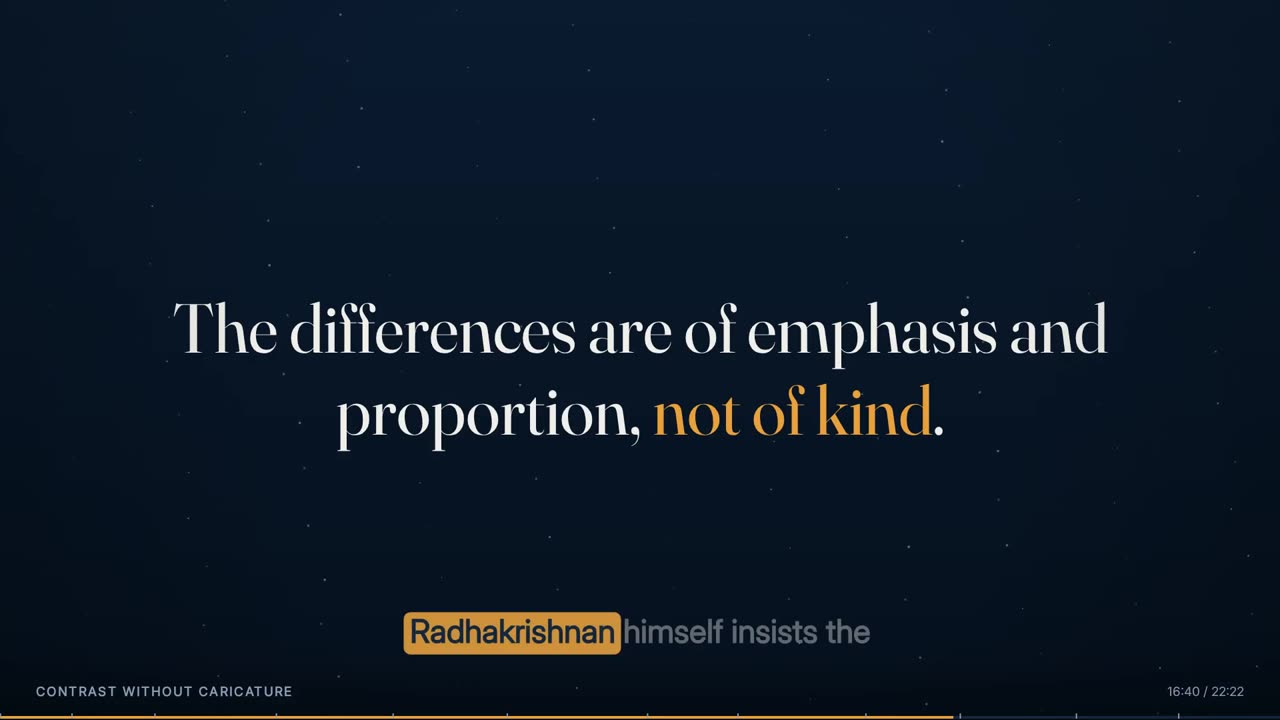
A quote on screen with the caption band running beneath it.
33

Caption band

The phrase being spoken, centred in the lower band, word by word

The caption band is the animated lecture's defining feature: the phrase being spoken, centred at y 950, at most nine words, with every word timed to the voice. Spoken words are at full ink, upcoming words at 40%, and the word being said right now is set heavier in the panel colour on a solid accent block. The band is drawn after the vignette and on its own layer, so nothing in the content layer can cover it. The full rules — chunking, timing and placement in every layout — are on the Transcript and Captions page.

Anatomy
  • Centre line y 950; measure 1500 px; up to 150 px tall (two lines)
  • UI 600, fitted 48 to 30 px, line height 1.24; current word UI 800
  • Current-word block: accent, radius 10 px x style factor, 9 px beyond the word each side, opacity 0.82 + 0.14 x emphasis
  • Appears 0.12 s before the first word; fades from 1.9 s after the last word over 0.9 s
Rules
  • Never shows a word that has not been spoken yet at full ink
  • Never moves with the content layer
A dark chapter's slam over Scholar's star field.
34

Chapter ground (dark)

The background of a dark chapter — the style's ground drawn behind everything

Every chapter has a ground drawn from the template style: a vertical gradient between two background tones, and over it the style's texture. In Scholar the dark ground is a field of 150 small stars that drift a few pixels and twinkle; Lattice draws a measured grid, Folio soft blobs, Beacon sliding blocks of flat colour, Slate two hairline rules. The ground moves at 40% of real time, so there is always slow life behind the content, but nothing that competes with it.

Anatomy
  • Gradient: bg at the top to bg2 at the bottom
  • Scholar stars: 150 points, radius 0.6-1.9 px, 55% layer opacity, drift up to 9 px
  • Other grounds: Lattice a 64 px grid with an accent dot every fourth crossing, Beacon two tilted bars of flat colour sliding across, Slate two hairlines at y 140 and y 940
Rules
  • The ground is drawn at t x 0.4
  • Texture is chosen by the style, never by the lecture
A light chapter's cards over Scholar's soft blobs.
35

Chapter ground (light)

The background of a light chapter

Light chapters use the style's light palette and light texture. In Scholar that is three large soft colour blobs — one in the accent, two in the second accent — each drifting slowly on its own path. Light ground is used for concept, definition and diagram chapters; dark for narrative and story.

Anatomy
  • Scholar blobs: centres near (430,300), (1520,760), (1180,180); radii 380, 440, 300 px; 20% colour at the centre fading to 0
  • Drift: up to 70 px horizontally and 52 px vertically over minutes
Rules
  • Blobs are radial gradients that reach zero inside their own radius — no hard edges
A dark chapter's columns, the palette fully on its dark side.
36

Dual-tone cross-fade

Light and dark chapters, and the 0.8 s blend between them

Every style ships a light and a dark palette, and every chapter is marked one or the other. At a chapter boundary the whole palette — ground, ink, panels, accents — is blended from one to the other over 0.8 s, centred on the boundary, rather than cut. Because every colour is mixed through a single value, switching style is one setting and switching light to dark is one number. In the lecture below the twelve chapters alternate, six dark and six light, starting dark.

Anatomy
  • Blend window: from 0.4 s before to 0.4 s after the chapter start
  • Every token (bg, bg2, ink, dim, line, panel, accent, accent2, good, bad) is interpolated channel by channel
  • Scholar dark accent #E8A03A, light accent #BA6A1E
Rules
  • Story beats sit on dark, concept beats on light
  • Nothing cuts colour abruptly
A slam in a dark chapter, framed by the vignette.
37

Vignette and silence beats

A soft darkening at the edges that closes in when the speaker pauses

A radial vignette darkens the corners of every frame. It is also the engine's silence beat: when the speaker leaves a real gap of more than 0.75 s between words, the vignette closes in by 90 px and darkens by a further 10%, ramping over 0.35 s at each end of the pause, so a pause for effect reads as punctuation rather than dead air.

Anatomy
  • Radial from 560 px (clear) to 1180 px (24% black) around the frame centre
  • In a silence beat: both radii minus 90 px, edge alpha 34%
  • Gap threshold: 0.75 s between one word's end and the next word's start
Rules
  • Only real gaps in the aligned words count
  • The beat eases in and out over 0.35 s
A definition with its load-bearing word lit, the block's strength following the voice.
38

Audio-reactive emphasis

The speaker's own loudness drives how hard things pulse

A per-frame loudness envelope is taken from the cleaned audio and used to scale emphasis: the arrival pulse on every card, chip, node and badge, the brightness of a lit word's block in a definition, and the opacity of the caption highlight. The signal used is the deviation above the speaker's own baseline, not raw loudness, so a quiet lecturer and a loud one get the same range, and one cough does not set the scale.

Anatomy
  • Envelope: 55 ms RMS window, sampled at 30 fps
  • Normalised to the 92nd percentile of speaking frames (frames above the 55th percentile), clipped at 2.5
  • Fast attack, slow release: rises at once, falls 16% of the way per frame
  • emphasis = clamp((envelope - 0.62) / 0.45, 0, 1); pulses x (0.72 + 0.5 x emphasis)
Rules
  • Emphasis scales motion that is already cued — it never triggers anything on its own
The agenda rail early on, with its later stops still dashed.
39

Ghost placeholders

Dashed outlines for parts that have not arrived yet

Any element that fills in over several seconds draws dashed outlines for its not-yet-arrived parts from the moment it appears: card slots, chips, chain nodes, rail rows, timeline markers, bar footprints, flow and cycle nodes, stack layers, layout zones. Without them the frame reads as broken for ten seconds at a time; with them the viewer sees the shape of what is coming before the content.

Anatomy
  • Dash 6-10 px; dim colour; 30-85% opacity depending on the element
  • Replaced in place by the real part on its cue
Rules
  • Mandatory for anything that fills in over time
  • A ghost never carries text
40

Chapter title card

An optional full-screen title held while the chapter title is spoken

A chapter can open on a full-screen title card that holds exactly as long as the title is being spoken, then dissolves into the chapter's content. The title is set large and centred with an accent rule under it; while the card is more than 92% visible the content layer is not drawn at all, and as it fades the content fades up underneath. The lecture below uses heroes instead, so its chapters carry no title card.

Anatomy
  • Title: display 700, fitted 96 to 44 px inside 1320 x 420 px, centred at y 500
  • Rule: 4 px accent, up to 300 px wide, 50 px below the title
  • Fades in over 0.45 s before the title's first word, out over 0.65 s after its last
Rules
  • Holds only while the title is spoken
  • Content is hidden behind it, not drawn through it
The deck on its own at 2:00, before it is composited into the film.
41

Layout boxes

The fixed grid every element is placed in

Elements are placed in named boxes rather than free positions, so a chapter's parts line up from one chapter to the next and two elements can be checked for collision before anything is rendered. The deck check refuses any two elements that are on screen at the same moment in the same chapter and share any part of their boxes.

Anatomy
  • Hero 260,350 1400x360 · Header 140,150 1240x180 · Bullets 210,420 1500x430 · Cards 180,440 1560x330
  • Chips 200,470 1520x220 · Define 230,360 1460x450 · Columns 180,380 1560x470 · Quote 300,440 1320x280
  • Slam 220,360 1480x400 · Chain 200,480 1520x180 · Rail 290,350 1340x520
  • All boxes end above y 900, leaving the caption band clear
Rules
  • Top of the frame stays clear so a branding bar can go over it later
  • Overlapping boxes on screen together fail the check

Rules

The rules, and the reason for each.

Hard rules are checked by the engine and stop delivery if they fail. Guides steer the choice but can give way when the lecture needs it.

TypeRuleWhy
HardThe deck has to keep moving. Where nothing on it would change for more than 8 seconds, that whole run is handed to Presenter + Animated — the same slide, at the same moment, with the lecturer beside it.Settled text is not a shot. Text that has finished arriving and then sits there is the thing a student stops watching, and holding the full frame for it is the defect that reads first.
GuideWrite elements that arrive in pieces: items on their own anchors, a definition lighting word by word, a diagram assembling node by node.A chapter whose diagram builds through it keeps the full frame; a chapter built on one line that lands and then sits will spend its minute beside the presenter.
GuideWhere a chapter has a shape — a process, a comparison, a proportion, a relationship — draw it. At least six drawn elements from four different types in a twenty-minute lecture.A diagram that assembles is a minute of screen that keeps changing, where a bullet list is three changes and then stillness.
HardNothing appears before its word is spoken.A viewer reading ahead of the speaker stops listening; a diagram that is finished before it is explained has nothing left to teach.
HardEvery cue is a phrase lookup, never a hard-coded time; an unfound phrase stops the build.Times drift when a recording is re-cut; a phrase moves with the word. A mis-typed cue must fail loudly, not land somewhere plausible.
HardThe audio wins over the script.Lecturers drop clauses and ad-lib. The screen must follow what was said; the script only corrects spelling.
HardNo branding is drawn into the deck — no logo, institution, course code or slide counter.Branding is a separate layer added later, so the same render can be topped and tailed for any institution. The top of the frame is left clear for it.
HardText is fitted to its box against its final content, then clipped.Fitting once means the type size never changes as lines arrive; clipping means a long line in some future lecture degrades instead of spilling over a border.
HardParts that fill in over time are shown as dashed ghosts first.Without placeholders a frame reads as broken for ten seconds at a time; with them the viewer sees how many things are coming.
HardTwo elements on screen together may not share any part of their boxes.Collisions are caught before rendering rather than found by eye afterwards.
GuideProgressive lists read as progress: passed items retire, the current one is lit.A wall of equal-weight lines tells the viewer nothing about where the speaker is.
GuideHeadlines are composed summaries, not quotations of the transcript.The caption band already carries the exact words; a headline has to add the shape of the argument.
GuideA note that simply repeats the sentence being spoken is cut.It is redundant with the caption band and competes with it for the same attention.
GuideDark ground for story and narrative, light ground for concepts and diagrams, blended over 0.8 s.The switch carries meaning — it tells the viewer the lecture has changed mode — instead of just alternating.
HardNo camera move on the content layer.A slow push across a long chapter moves the frame by a fraction of a pixel per frame and makes canvas text shimmer. The motion that reads as life is in things arriving and words lighting; the ground still moves behind.
HardEmphasis only scales motion that is already cued.Loudness decides how hard a pulse lands, never whether something appears — so a cough cannot put anything on screen.
GuidePauses over 0.75 s become silence beats.A pause for effect should read as punctuation, not dead air.
GuideNever animate faster than the speech.Entrances of a quarter to half a second keep motion subordinate to the voice.
HardThe full-frame deck never holds longer than 60 s at a stretch.Past a minute an unbroken deck becomes a slideshow with narration; an 8 s cut to the presenter breaks it at a fifth of the cost of a full presenter scene.
HardA stretch of 4.5 s or more where the full-frame deck has nothing on it goes to the presenter.An empty slide filling the frame is dead air; beside the presenter it is not.
HardDefinitions, quotes and heroes are protected from cutaways.They are the moments the deck was written for; a picture over a definition replaces the best thing on screen.
HardThe frame is always 1920 x 1080 and is never downscaled to save size.Resolution and file size are solved separately; a blurry master is almost always a skipped rule upstream.
HardFonts must load before the first frame; a missing face stops the render.Otherwise the renderer silently falls back to a default face for the whole lecture.
HardThe renderer holds no taste of its own; everything visual comes from the template style.A new institution's look is a new style entry, not a new build.

Settings

Every setting, with its value.

These are the values the engine runs with today. The name in small type is the setting as it appears in the engine, for anyone comparing notes with a producer.

SettingValueWhat it does
Settled-text ceilingSTATIC_MAX8 sHow long the deck may hold the frame alone with nothing changing on it before the run goes to Presenter + Animated.
Frame size and rateW, H, FPS1920 x 1080, 30 fpsFixed for every lecture.
Entrance durationmotion.enterScholar 0.45 s · Lattice 0.28 s · Folio 0.55 s · Beacon 0.22 s · Slate 0.35 sHow long an element takes to arrive. Some elements stretch it (x 1.11 for heroes, slams and quotes; x 1.6 for bars).
Entrance curvemotion.easecubic (Scholar, Folio, Slate) · quint (Lattice, Beacon)Ease-out shape of every arrival.
Rise on entrymotion.rise16 px Scholar · 10 px Folio · 0 px Lattice, Beacon, SlateHow far an element lifts as it lands.
Overshootmotion.overshoot0.06 Beacon · 0 elsewhereMakes a graphic style feel struck rather than placed.
Arrival pulse0.8 s (0.9 s on cards, 0.7 s on timeline markers)How long the accent border or ring lasts after an item's word.
Corner radius factorshape.radius1.0 Scholar · 0.18 Lattice · 0.35 Folio · 0 Beacon · 0.25 SlateMultiplies every corner radius (base 8-22 px).
Stroke weightshape.stroke2.2 Scholar · 1.8 Lattice · 1.6 Folio · 3.0 Beacon · 1.4 SlateLine weight of spines, edges, arcs and outlines in the diagrams.
Kicker trackingshape.tracking2.6 px Scholar (1.6-3.4 px across styles)Letter spacing of small tracked capitals.
Palette blend0.8 s centred on the chapter startCross-fade between a chapter's light and dark palettes.
Emphasis window55 ms RMS at 30 fps; 92nd percentile of speaking framesHow the loudness envelope is measured and normalised.
Emphasis threshold(envelope - 0.62) / 0.45, clamped 0-1Only the deviation above the speaker's usual level counts.
Envelope release0.16 per frameEmphasis snaps in and decays over several frames.
Silence beat threshold0.75 sA gap between words longer than this closes the vignette.
Silence beat depthvignette radius -90 px, edge +10% darker, 0.35 s rampsHow strongly a pause is marked.
Ground speed40% of real timeBackground texture drifts slower than the content so it never competes.
Caption band size48 px down to 30 px, measure 1500 px, centre y 950The band's type is fitted per phrase to at most two lines.
Caption holdfade starts 1.9 s after the last word, gone at 2.8 sThe last phrase lingers into a pause, then clears.
Full-frame run capFULL_MAX60 sLongest unbroken stretch of the full-frame deck.
Break lengthBREAK_LEN8 sLength of the presenter cut that breaks a long animated run.
Empty slide limitEMPTY_MIN4.5 sA full-frame deck with nothing on it for this long goes to the presenter.
Render chunkCHUNK900 frames (30 s)Unit of resumable rendering.
Frames per round-tripBATCH5Frames drawn per request to the renderer.
Encode qualityconstant quality 20, stills at 0.93Master-quality deck; size is never bought with resolution.

Checks

What is verified before it ships.

Every anchor phrase resolves

Each element, item, node, column and definition chunk must find its phrase in the transcript after the previous cue; one miss stops the build and names the phrase.

Cue windows

No item may be cued more than 0.6 s before its element appears or after it leaves, and no element may end before it starts.

No collisions

Two elements that share the screen in the same chapter may not overlap by a single pixel of their boxes.

Pace report

The deck check prints cue points, changes per minute and the longest hold with nothing new, so a slack chapter is visible before render.

Fonts and pictures ready

The render refuses to start until the style's typefaces are loaded and every picture is decoded.

Composition gates

The plan confirms the full-frame deck never holds over 60 s and flags any empty stretch over 4.5 s that was not given to the presenter.

Words shown against words heard

Fourteen 7-second windows of audio are transcribed again independently and compared with the words the video displays in each; the mean similarity must reach 0.85.

Artefact relationships

Before delivery the guard confirms every assembled piece still matches the deck and transcript it was drawn from, so a stale render cannot ship.

Worked example

In a real lecture

The sample lecture is the first topic of a BBA course on Indian wisdom and philosophy: 22 minutes 22 seconds of a single presenter, built in the Scholar style. Its transcript runs to 2,663 words.

The deck divides it into twelve chapters, alternating dark and light and opening dark on the welcome: Welcome, Today's Path, Aarav on the Ghats, What Philosophy Is, A Family of Systems, Origins and Breadth, Orthodox Not Theist, Indian and Western Contrasts, Contrast Without Caricature, Why Study It Today, Two Who Carried Darshana to the World, and Recap and Next Steps.

Across them sit 61 elements: 15 slams, 11 heroes, 7 quotes, 6 headers, 6 card rows, 5 bullet lists, 4 column comparisons, 3 definitions, 2 chains, one row of chips and one agenda rail. Together they resolve to 186 cue points — about 8 changes on screen a minute — with a longest hold of 41.9 s. Every one of those cue points is a phrase the presenter actually said.

In the finished film the deck holds the full frame in 24 runs totalling 894.8 s, two thirds of the lecture, and plays inside the slide card beside the presenter for another 249.3 s. The caption band beneath it steps through 482 phrases, and 12 pauses of more than 0.75 s become silence beats.

22:22 (1,342 s)Runtime
ScholarStyle
12 (6 dark, 6 light)Chapters
61Elements
186Cue points
66.7% in 24 runsFull-frame share
482Caption phrases
12Silence beats

Limits

What it deliberately does not do.

  • It never shows a word or diagram part before it is spoken — so anything that would put new words on screen (a quiz, a summary) belongs in a pause or after the audio ends, and is marked as commentary.
  • The deck is composed per lecture; the engine does not invent content the lecturer did not say.
  • It draws no branding of its own. Logos and institution names are separate layers.
  • It does not move a camera over the content layer; slow life comes from the ground and from things arriving.
  • Emphasis follows loudness only. It cannot tell irony from stress.
  • It is only as accurate as the transcript's timings: a word the recogniser places wrongly will be highlighted at the wrong moment until the transcript is repaired.
  • Frame size is fixed at 1920 x 1080; other aspect ratios are not produced from the same render.

Works with

How it meets the other effects.

Questions

What educators ask about it.

Do we have to supply slides?

No. The deck is composed from the recording itself, with the lecturer's script used only to correct spelling. If a script exists it helps; if not, the transcript is enough.

What happens if the lecturer goes off-script?

The audio wins. Every element is tied to a phrase that was actually spoken, so an ad-lib is simply part of the timeline and a skipped section never appears on screen.

Can we change the look for a different course?

Yes. Pick one of the eighteen template styles, or add a new one. Typefaces, both palettes, ground, corner radius, stroke weight and motion all change together; the deck itself does not need rewriting.

Will the text ever overflow a box?

It is designed not to. Each element fits its type to its box against the final content, steps the size down if needed, and clips as a last guard, and the deck check refuses overlapping boxes before rendering.

Why doesn't the frame zoom or pan?

Moving the whole frame by fractions of a pixel makes on-screen text shimmer. The engine keeps text still and puts motion in the arrivals, the word highlighting and a slowly drifting background.

How do you know the words on screen match the audio?

Before delivery, fourteen short windows of the audio are transcribed again independently and compared with the displayed words; a mean similarity under 0.85 means the alignment is wrong and the lecture is not shipped.

All effects

Every effect has a page like this one.

See this effect on your own lecture.

Send a recording and we'll run it through the pipeline as a pilot — one free sample per institution.