Engine/Effects/Presenter Styles

Presenter + Animated

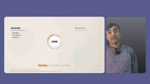
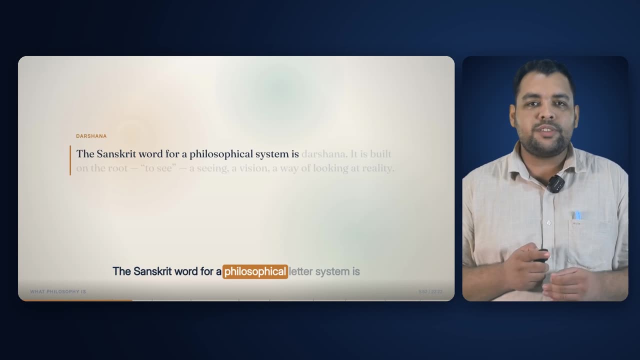
The fully animated lecture and the real lecturer side by side: the animated slide in a large rounded card on the left, and the presenter, keyed off the green screen, framed in a portrait card on the right. It is the planner's middle layout, used where a stretch is neither clearly structure nor clearly delivery and needs both the slide and the face.

slide card · presenter card · one stage

The finished effect

What it looks like when it is done.

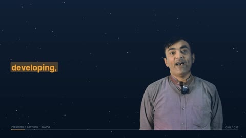
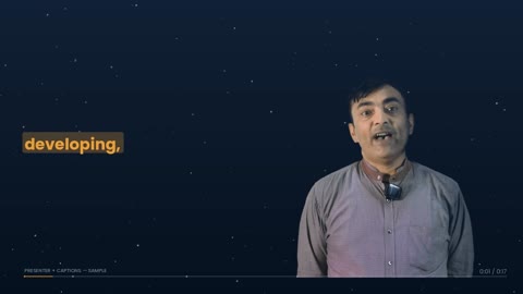
Presenter + Animated from a produced lecture, with sound: the animated slide on the left building on the words that introduce each point, the keyed presenter in a card on the right.

35 s · 1920 × 1080 · with sound

Overview

What it is, and why it exists.

Presenter + Animated is a compositing pass on top of the animated lecture, not a separate design. The slide card holds the same animated frame the Full Animated Lecture shows: every element, the caption band and the progress bar, scaled down to 68% and given rounded corners. Beside it, in its own portrait card, the presenter stands on a slightly lighter panel of the same blue stage, cropped the way a framed camera shot fills its frame.

It exists for the passages that need both. When a lecturer is explaining a diagram while also talking to the student, full-frame graphics lose the person and a talking head loses the diagram. The composition planner gives this layout any stretch where the structure score and the delivery score are within a factor of 1.6 of each other: ambiguity resolves to the middle. It is also the layout that appears immediately after the opening, and the planner makes sure every lecture uses it at least once.

It depends on everything upstream. The animated deck must already be rendered for the full runtime. The cleaned presenter footage and the voice track come from Video Cleanup and Studio Sound. The key and the presenter box are measured from this recording, and the stage colours come from the template style. Because the deck and the presenter footage are both built on the plan's timeline, the two layers are in sync by construction. The engine never has to estimate an offset between them.

The written specification describes two placements, side-by-side and a corner inset. The engine builds side-by-side only. It survives a pacing presenter, because the presenter's card is a fixed box beside the content, and it never covers a slide element or the deck's own timer.

1310 × 736 at (54, 168)Slide card
498 × 736 at (1387, 168)Presenter card
23 pxGap between cards
26 pxCorner radius
68% of the full frameDeck scale
cover, centre-cropped, feet keptPresenter fit
8 s (hard)Shortest scene
5 runs, 249.2 s, 18.6%In the sample lecture

How it is made

Step by step, in the order the engine runs it.

Render the animated lecture for the whole runtime

The deck is rendered once, full length, at 1920×1080: every element, the caption band, the chapter title and the progress bar. The same file is cut for Full Animated stretches and scaled into the slide card for Presenter + Animated, so nothing inside the slide changes between the two layouts.

Measure the key and the presenter

The backing colour and the key's reach are measured from nine frames of this recording, choosing the smallest reach that clears the backing without eating the presenter. The presenter box is measured across 48 frames. For this layout a second, tighter box is taken from the 15th and 85th percentiles of the presenter's left and right edges. Beside a slide the presenter is small, and the room the full union reserves for rare gestures would make them smaller still. Trimming to the tighter box gives up the extreme of a reach and gains about a third more of the presenter's height on screen.

Draw the stage and the card masks once

The stage is drawn once as a still: the style's dark-blue radial ground with light pooled behind the presenter's card, soft drop shadows under both cards, and the presenter's card painted a step lighter in the same hue. Two rounded-corner masks are drawn at exactly the size of each card. They are reused for every piece, so there is one small cost at the start of a build instead of faking rounded corners on every frame.

Let the planner choose the stretches

The composition planner scores each stretch for Presenter + Animated as delivery + 0.35 × structure, and at the beat level sends it every beat where neither score beats the other by a factor of 1.6. It must be a real scene, at least 8 s long, and no layout may hold for more than 120 s. It counts toward the 66% presenter cap, but not toward the 16% cap on the framings that are only his face. If the schedule ends up without it, the longest animated stretch that fits under the cap is converted to Presenter + Animated.

Put the slide into its card

For each stretch, the same time range is cut from the rendered deck, scaled to 1310 × 736 and given the rounded mask. It is laid onto the stage at (54, 168).

Put the presenter into theirs

The same time range is cut from the cleaned footage. It is keyed, despilled and given the shadow-side lift, then cropped to the tight presenter box. It is scaled to cover the 498 × 736 card, meaning large enough to fill it in both directions, and centre-cropped horizontally with the feet kept at the bottom. The presenter is laid onto their card, cut from the same stage image, and only then is the finished card masked to its rounded corners and placed at (1387, 168). The order matters. Masking the keyed presenter directly replaced the key's transparency with the card shape, and the studio wall they were shot against came back as a flat panel.

Hold the frame rate

Every still image fed into the composite is held at 30 fps. A looped still defaults to 25 fps, and because the stage is the base layer, a piece would then encode at 25: the same duration but a sixth fewer frames, pulling every piece after it out of sync with the audio.

Drop in cutaways where scheduled

A cutaway inside a Presenter + Animated stretch replaces the whole frame, both cards included, with the caption band burned over it, then hands back to the two cards.

Verify and join

Each piece is checked against its expected frame count, within 2 frames, and stamped with fingerprints of the deck, stage, masks, footage, key, crop and look it was built from. The pieces are joined and the studio voice track is added once. Before delivery the finished film's sound is traced back to the cleaned voice at three points.

Elements

Everything this effect puts on screen, one piece at a time.

Each element below is shown as the engine actually produced it, in the real lecture, with its parts, and the rules that govern it.

The Presenter + Animated stage as drawn for the sample lecture: blue radial ground, card shadows and the presenter's lighter well on the right.
01

The stage

The dark-blue ground both cards sit on.

Behind both cards is the same radial ground every presenter layout stands on, taken from the template style's stage colours. Here it is centred to the right, at (1500, 430) with a 1500 px radius, so the light pools behind the presenter's card rather than in the middle of the frame. Each card casts a soft shadow onto it, which lifts the cards off the ground without a hard outline. The stage is drawn once per lecture as a still and reused for every piece.

Anatomy
  • Radial gradient: core → mid → edge, eased so no banding ring shows
  • Scholar colours: core #173058, mid #0C1B36, edge #060D1E
  • Centre (1500, 430), radius 1500 px
  • Card shadows: each card's shape offset 6 px right and 16 px down, radius + 4, blurred 28 px, blended toward near-black (2, 6, 16) at 170/255
Rules
  • The stage colours come from the style, not from the slide's light or dark palette
  • The same values are used by the live renderer and the pre-drawn stills, so there is no colour step at a cut
  • The stage is not tinted to match a chapter
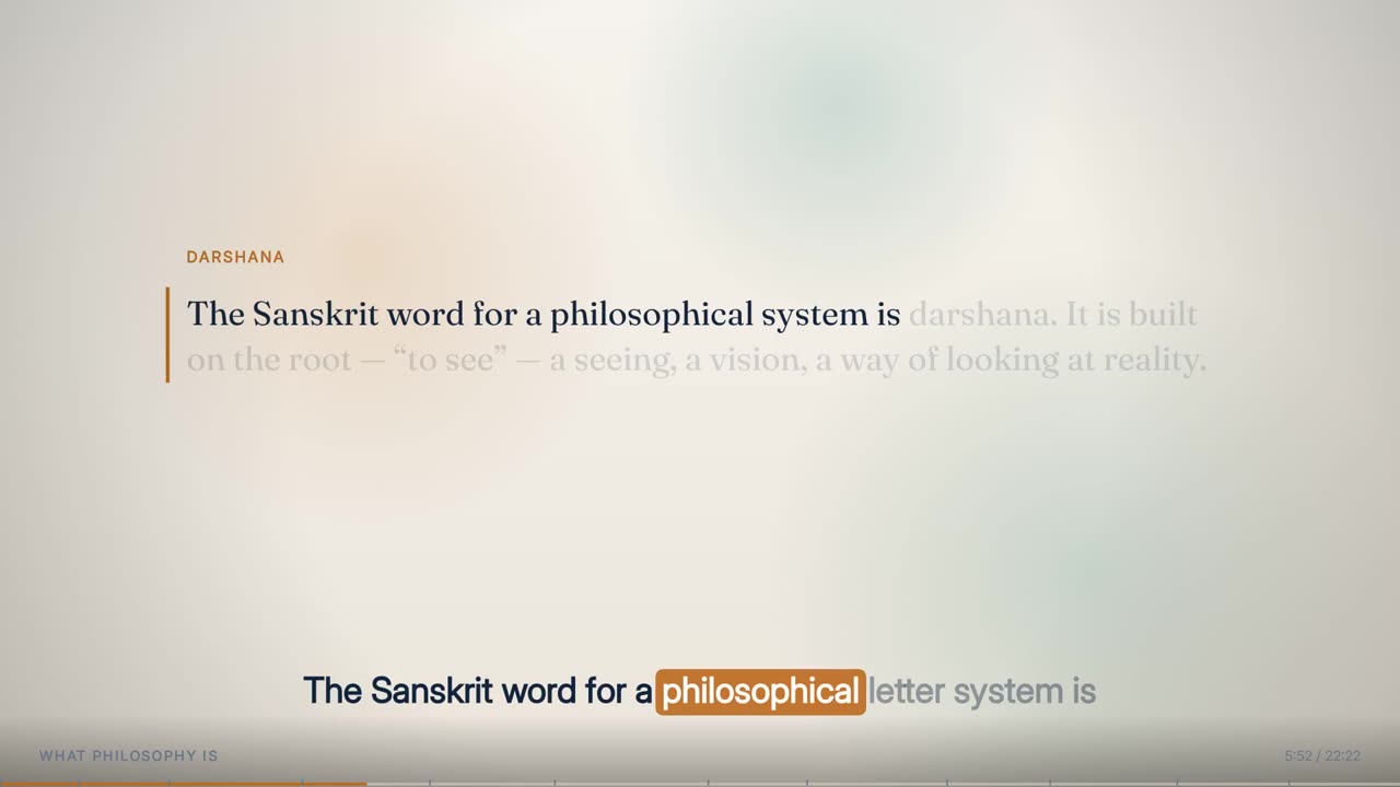
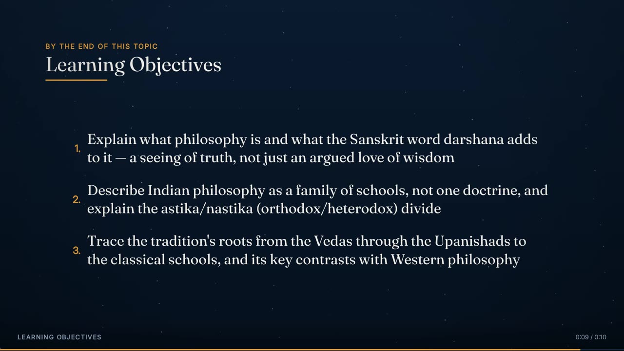
The animated deck alone at 5:52, before it is scaled into the slide card.
02

The slide card

The full animated lecture frame, scaled into a rounded card on the left.

The slide card is not a separate deck. It is the Full Animated Lecture frame itself, cut from the same full-length render, scaled from 1920 × 1080 to 1310 × 736 (68%) and given rounded corners. Everything the animated lecture shows is inside it: the chapter's elements arriving on their words, the word-highlighted caption band along its bottom, the chapter title, timer and progress bar. Because it is the same frame, a cut between Full Animated and Presenter + Animated looks like the slide stepping back to make room, not a change of content.

Anatomy
  • Position (54, 168), size 1310 × 736 (a 16:9 card)
  • Margins: 54 px left, 168 px above, 176 px below
  • Corner radius 26 px, anti-aliased mask cut to the card's exact size
  • Contains the deck's own caption band and chrome
Rules
  • Nothing inside the slide changes for this layout: same elements, same timing, same style
  • The slide card and the full-frame deck are cut from one render, so they cannot drift apart
  • The slide is scaled, never cropped: no element at the edge of the deck is lost
The slide card's rounded mask: white is kept, black shows the stage.
03

The slide mask

The rounded-rectangle shape that cuts the slide to its card.

A grayscale mask, exactly the size of the slide card, white inside a 26 px rounded rectangle and black outside. It sets the slide's transparency so the stage shows through at the corners. It is drawn once per build as an image instead of being computed inside the frame-by-frame composite.

Anatomy
  • 1310 × 736 px, grayscale
  • 26 px corner radius
  • Applied as the slide layer's alpha before it is laid on the stage
Rules
  • The mask is drawn at the card's exact pixel size, never scaled, so the corners stay clean
The presenter card's rounded mask, sized exactly to the 498 × 736 card.
04

The presenter card

The portrait panel on the right that frames the lecturer.

The presenter's card is a portrait panel beside the slide, the same height as the slide card. Its ground is a lighter well of the same blue as the stage behind it, a small radial gradient brightest a third of the way down where the face will be. It is cut from the same stage image, so the colour at its edge matches the stage exactly. The presenter is laid onto this card first, and only then is the finished card given its rounded corners.

Anatomy
  • Position (1387, 168), size 498 × 736 (about 0.68 wide to tall)
  • Card ground: radial, centre at half width and 34% height, radius 0.92 × card height
  • Card colours: stage edge × 1.35 at the rim, stage core × 1.18 at the centre
  • Corner radius 26 px, matching the slide card
  • Gap to the slide card: 23 px; right margin 35 px
Rules
  • The presenter's ground is a step up from the stage in the same hue, never a different colour
  • The card is masked after the presenter is composited into it, never before
  • The card is the same height as the slide and top-aligned with it
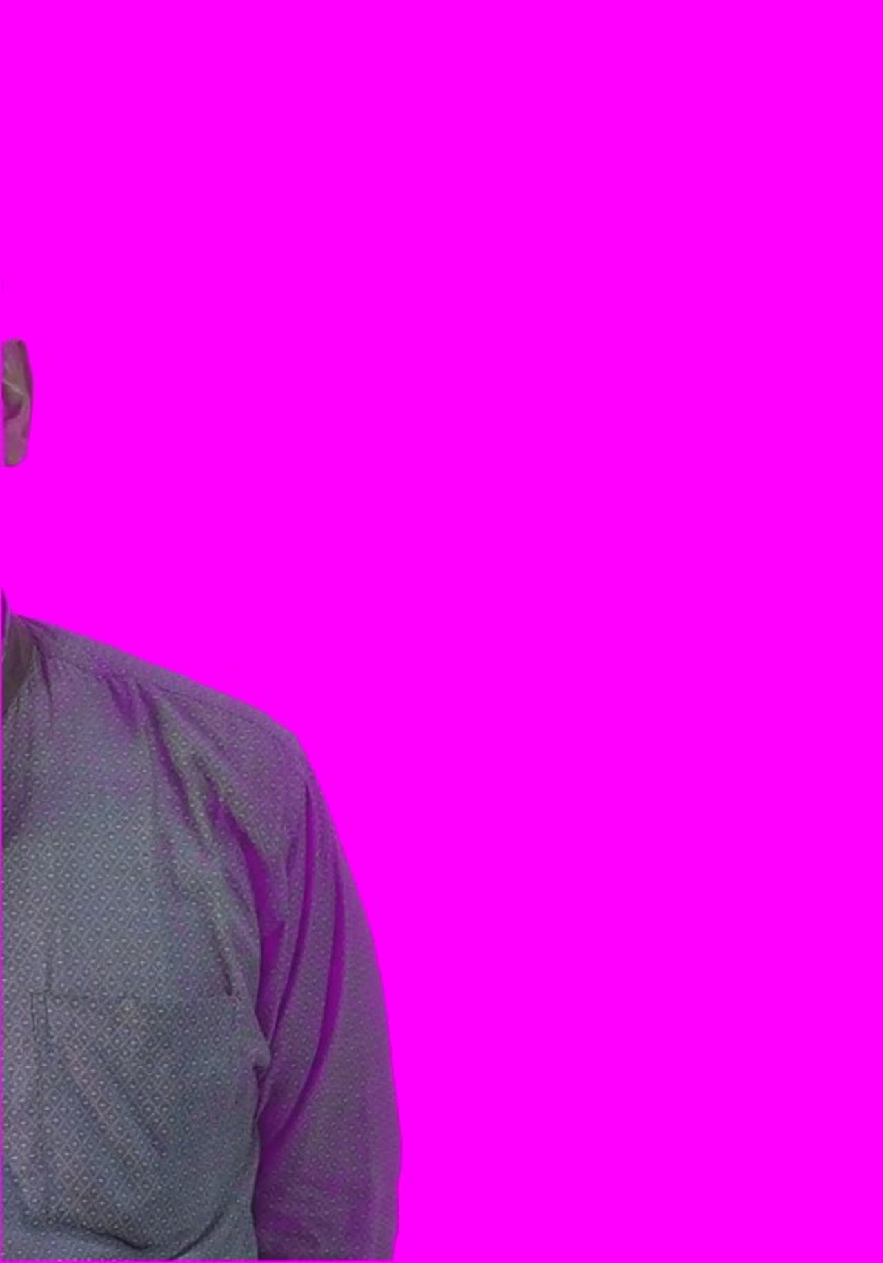
The keyed presenter over saturated magenta, the full-resolution test that makes any green fringe at the hair or shoulders obvious.
05

The keyed presenter

The lecturer, cut out and cropped to fill their card like a framed camera shot.

The presenter is keyed with the lecture's measured key and despilled, given the shared shadow-side lift, and cropped to the tight box. That box is taken at the 15th and 85th percentiles of the presenter's side-to-side movement across the recording, because a small panel beside a slide cannot afford the air that rare gestures need. The crop is scaled to cover the card, large enough to fill both its width and its height, and the extra width is trimmed equally from both sides. Nothing is trimmed from the bottom, so the feet stay on the card's lower edge. The panel is filled the way a camera shot fills its frame, not with a small figure floating in a box.

Anatomy
  • Crop: the tight presenter box (in the sample lecture 998 × 992 source px at x 493, y 87)
  • Cover scale = the larger of 498 ÷ box width and 736 ÷ box height (0.742 in the sample lecture → 740 × 736)
  • Horizontal centre crop to 498 px (121 px trimmed each side in the sample lecture)
  • Key: measured colour and reach, softness 0.06 by default, despill mix 0.5
  • Shadow lift 0.35 by default, identical to every other presenter layout
Rules
  • The tight box is used only here. The full-frame presenter layouts use the full movement box
  • The key-and-look filter is the one shared by all presenter layouts, so the presenter looks the same at every cut
  • Keyed transparency must survive: the presenter is composited onto the card before the card's mask is applied
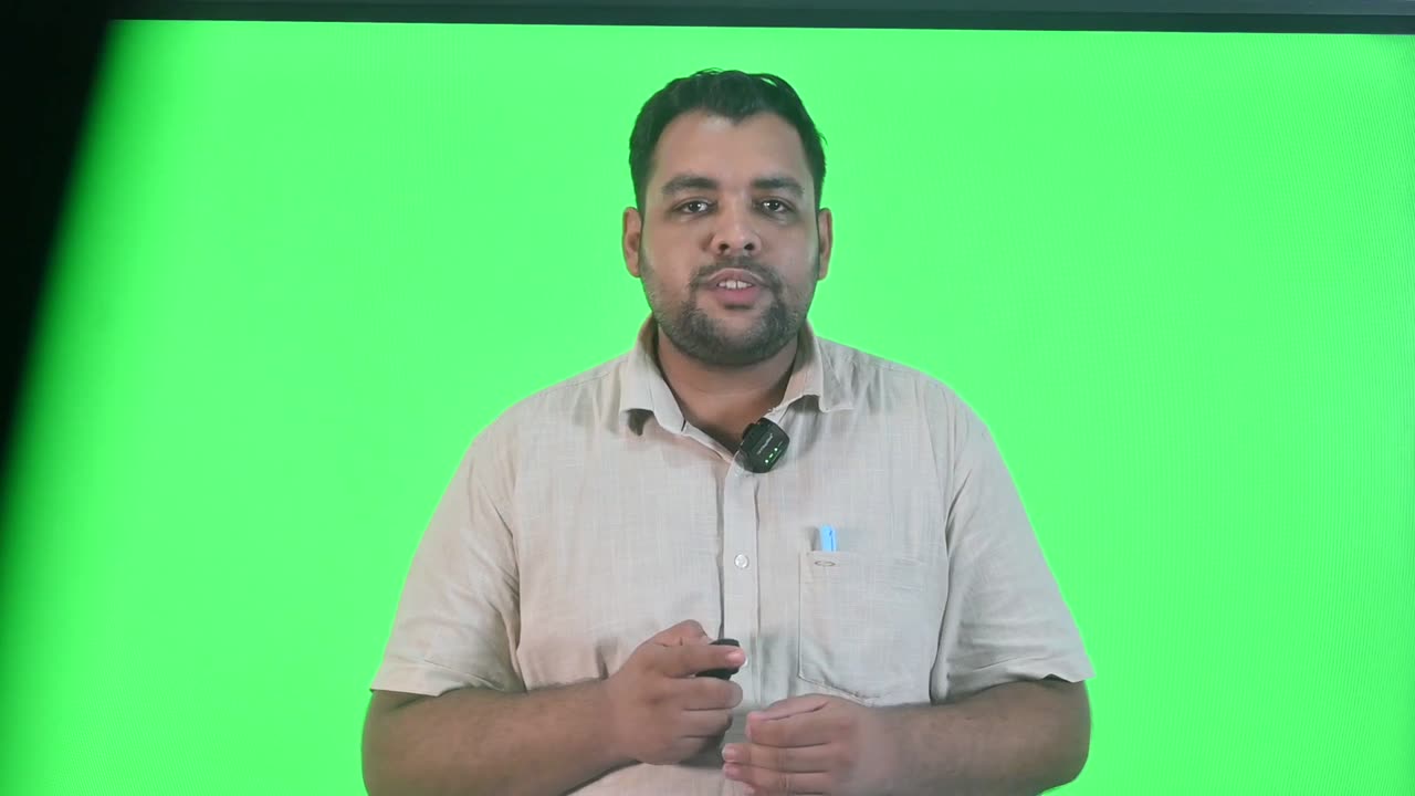
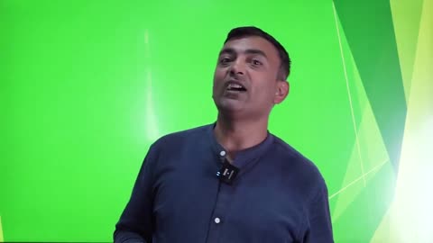
The cleaned green-screen recording at 5:52, before keying.
06

The raw recording

What the presenter layer starts from: the cleaned green-screen take.

The source for the presenter card is the cleaned recording, with dead air and false starts already removed by Video Cleanup and on the same clock as the plan and the deck. The backing is a lit green cloth that does not reach the edge of the frame. The engine measures the colour and reach of the key, and the box the presenter moves in, from this footage and nothing else.

Anatomy
  • Same timeline as the plan and the deck, so there is no sync offset
  • The backing colour is measured by shape (green exceeding red by 40 and blue by 60), so it holds whether the cloth is lit warm or cool
  • The outer 5% of each side is ignored when measuring the presenter
Rules
  • The build stops if the key has not been measured for this footage
  • A key or crop measured on different footage fails the delivery check
The two cards measured on a finished frame: slide card 1310 × 736 at (54, 168) in pink, presenter card 498 × 736 at (1387, 168) in orange.
07

Composite order

The fixed layering that builds each frame.

Each Presenter + Animated frame is built in the same order. The stage goes down first. The slide, scaled and masked, is laid onto it. Separately, the presenter's card is cut from the same stage image, the keyed presenter is laid onto that card, and the result is masked to its rounded corners and placed on the right. Doing it in this order is what keeps the key's transparency. Applying the card mask straight to the keyed presenter replaced their transparency with the card's shape, so the backdrop they were shot against came back as an opaque flat panel.

Anatomy
  • 1 · stage (still, 30 fps)
  • 2 · slide: deck cut → scale 1310 × 736 → rounded mask → overlay at (54, 168)
  • 3 · presenter card: stage crop 498 × 736 at (1387, 168)
  • 4 · presenter: key → despill → shadow lift → tight crop → cover scale → centre crop → onto card
  • 5 · card mask → overlay at (1387, 168)
Rules
  • Every looped still is read at 30 fps. A 25 fps default once encoded pieces a sixth short on frames
  • The presenter's card background is cut from the same stage image, so its edge colour matches exactly
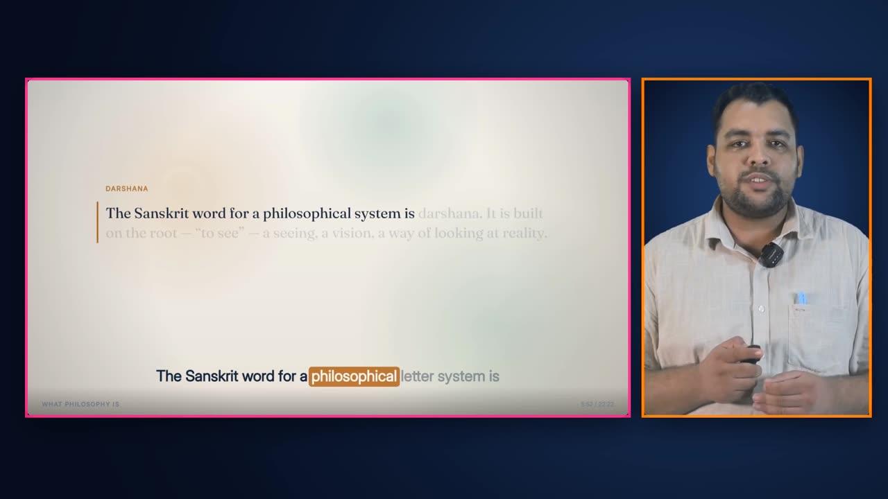
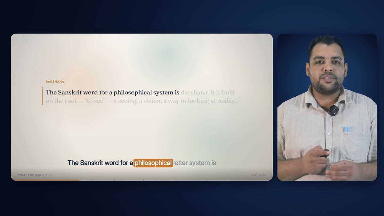
A finished Presenter + Animated frame from the sample lecture at 5:52.
08

The finished frame

Slide and presenter together on one stage.

The result reads as a produced lecture shot on one set: the animated slide doing the explaining on the left, the lecturer visibly present on the right, and the caption band inside the slide carrying the words. The presenter's mouth, the highlighted caption word and the element arriving on the slide are all driven by the same timeline, so they happen together.

Anatomy
  • Two cards, 23 px apart, top-aligned at y = 168
  • Captions: the deck's own caption band, inside the slide card
  • Timer and progress bar: the deck's own, inside the slide card
Rules
  • No caption column in this layout. The slide's caption band carries the words
  • No logo or institutional mark. The watermark is a separate, later effect
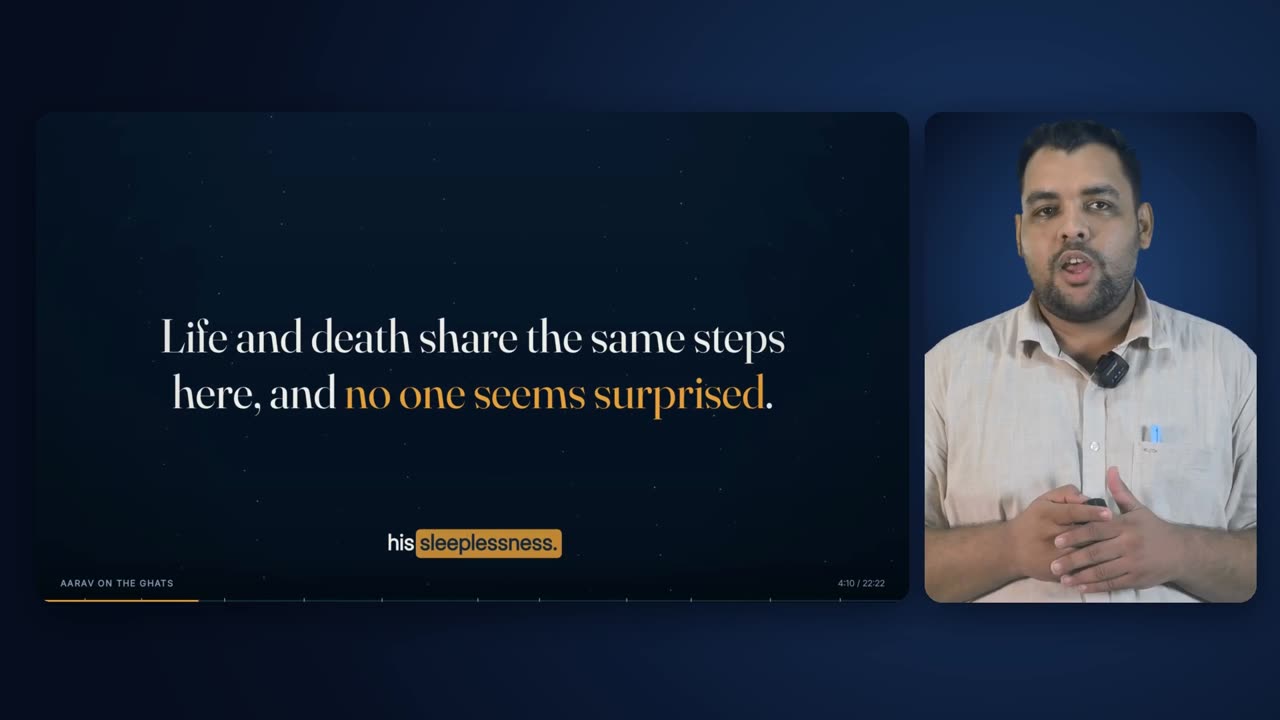
Presenter + Animated at 4:10, inside a 70.7 s run that began at 3:18.9.
09

A mid-lecture scene

How the layout looks through a long explanatory stretch.

Presenter + Animated is a scene, not a cut. Where Presenter + Captions and Presenter Centred last seconds, this layout can hold for a minute or more. In the sample lecture its longest run lasts 71.8 s, while the slide builds an argument element by element and the presenter explains it. The upper limit is 120 s for any layout, and the lower limit is 8 s, because a slide-and-presenter frame that appears for three seconds looks like a flicker.

Anatomy
  • Scene length 8–120 s
  • Sample lecture runs: 3.6 s, 70.7 s, 71.8 s, 47.4 s, 55.8 s
Rules
  • At least 8 s (hard)
  • No layout run longer than 120 s (hard)
  • Never placed beside another run of the same layout
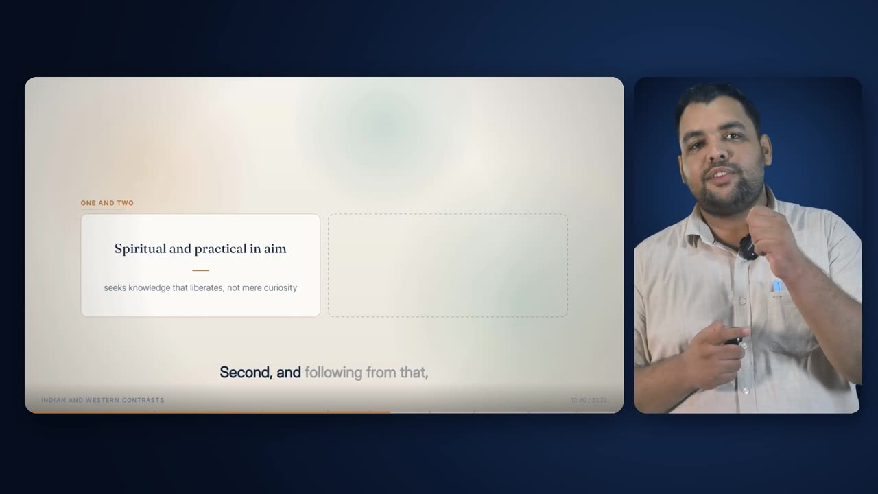
Presenter + Animated at 13:40, in the run from 13:31 to 14:19.
10

A later chapter

The same framing in a different chapter.

Because the slide card is the animated lecture itself, the layout carries the chapter's own theme with it. A dark narrative chapter and a light concept chapter both appear in the card, while the stage and the presenter's card stay the same blue. The presenter looks the same in every chapter.

Anatomy
  • Slide content and palette follow the chapter
  • Stage and presenter card are constant for the whole lecture
Rules
  • The stage is never re-tinted to follow the slide
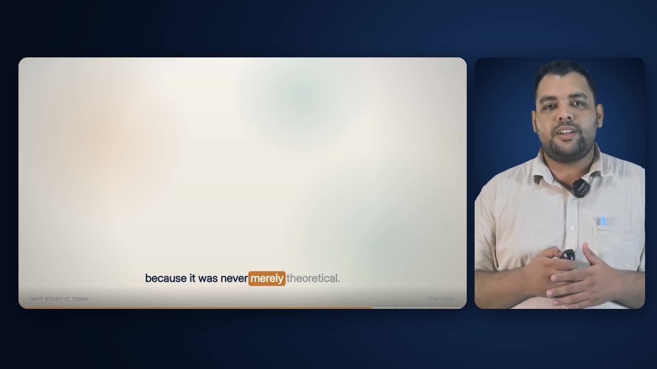
Presenter + Animated at 17:40, in its last run of the sample lecture.
11

Late in the lecture

The layout's last scene in the sample lecture.

The planner spreads Presenter + Animated through the lecture instead of grouping it. In the sample lecture its scenes come at the start of the story, in the middle of the definitions, and twice in the second half, each separated by animated stretches and short presenter cuts.

Anatomy
  • Last run 17:28.5 – 18:24.2 (55.8 s)
Rules
  • Spread by the schedule, not placed by hand
At 3:25 a drawn Pan & Zoom cutaway has replaced the two cards, with the caption band carried over it.
12

Cutaways inside the layout

Full-frame pictures that replace both cards for a few seconds.

A cutaway scheduled inside a Presenter + Animated stretch takes over the whole frame, slide and presenter together, for its 3–7 seconds, with the caption band burned across the bottom. Then both cards return exactly where the lecture has got to. In the sample lecture 13 of the 50 cutaways land inside this layout.

Anatomy
  • Cutaway covers 1920 × 1080
  • Caption band over it on a dark gradient from y 820
  • Not within 1 s of a layout change
Rules
  • A cutaway never overlaps a layout change
  • The words are never taken away by a picture

Rules

The rules, and the reason for each.

Hard rules are checked by the engine and stop delivery if they fail. Guides steer the choice but can give way when the lecture needs it.

TypeRuleWhy
HardThe engine builds the side-by-side placement only.A presenter box inset over the slide would cover slide content and collide with the deck's own timer. A fixed card beside the slide survives a pacing presenter.
HardThe slide card is the Full Animated Lecture frame, cut from the same render.The deck is built once. The two layouts cannot drift apart, and cutting between them reads as the slide stepping back, not changing.
HardThe presenter stands on the right.It is the same side as in Presenter + Captions, so the face never changes sides at a cut.
HardDeck and presenter footage share the plan's timeline, so no sync offset is estimated.The mouth must match the voice within about two frames. Viewers notice a lip-sync error far faster than a drifting caption.
HardAny deck built outside the pipeline must have its offset measured by cross-correlation at two separate windows.If the two windows disagree, the deck contains an internal cut. Averaging them would ship a guess, so the offset is found piecewise instead.
GuideThe presenter is cropped to the tight box (15th–85th percentile of side-to-side movement).Beside a slide the presenter is small. Reserving room for rare gestures would make them smaller still, and the tight box gains about a third of their height.
GuideThe presenter is scaled to cover the card and centre-cropped, with the feet kept.A filled panel reads as a framed camera shot. A small figure floating in a box reads as a webcam.
HardThe presenter is composited onto the card before the rounded mask is applied.Masking the keyed layer directly threw away the key, and the backdrop came back as a flat opaque panel.
GuideThe presenter's card is a lighter well of the stage's own blue.A neutral photographic backdrop suits a framed camera shot. Taking it from the stage makes the card and the ground one set, with no colour mismatch at its edge.
GuideBoth cards share a 26 px corner radius and the same top edge.The frame reads as one designed composition, not two videos placed side by side.
HardThe stage colours come from the template style and match the other presenter layouts exactly.The three presenter framings must look like one set. A colour step at a cut is the most visible flaw in a film.
HardEvery still image input is held at 30 fps.A 25 fps default made pieces encode a sixth short on frames, pulling everything after them out of sync.
HardScenes in this layout last at least 8 s.It is a scene, and a slide-and-presenter frame that appears for a few seconds looks like a flicker.
HardNo layout, this one included, holds for more than 120 s.Held longer, a layout stops being a choice and becomes the format.
HardThis layout counts toward the 66% presenter cap, and not toward the 16% cap on the framings that are only his face.The presenter is visible in it, but so is the slide: it adds information where a talking head does not, which is why the two are capped separately.
HardWhere the animated lecture would hold the frame alone with nothing changing on it for more than 8 seconds, that whole run becomes this layout.Settled text is not a shot, and the same slide with the lecturer beside it is the right register for a chapter he is talking through rather than building.
GuideOn a typical lecture this layout now carries between a half and two thirds of the runtime.It reads as a lecture rather than a slideshow, and it was the register the films were short of.
HardMixed stretches go to this layout: neither structure nor delivery beats the other by 1.6×.A stretch has to be clearly one thing to earn a committed layout. Ambiguity always resolves to the middle.
GuideEvery lecture uses this layout at least once.In a short lecture the animated lecture can win every segment on structure, and the presenter-beside-slide register would never appear.
HardThe key and look are the same filter as every other presenter layout.Two copies that drift make the presenter change complexion at a cut.
HardThe output carries no logo or course code.The render stays unbranded so any institution can use it. The watermark is its own effect.
HardA piece is rebuilt if the deck, stage, masks, footage, key, crop or look it came from has changed.A cached piece built with last week's key is complete, the right length and still wrong.

Settings

Every setting, with its value.

These are the values the engine runs with today. The name in small type is the setting as it appears in the engine, for anyone comparing notes with a producer.

SettingValueWhat it does
Slide cardPA_SLIDEx 54, y 168, 1310 × 736 pxWhere the animated deck sits and how large it is drawn.
Presenter cardPA_PRESx 1387, y 168, 498 × 736 pxWhere the presenter's portrait card sits.
Corner radiusR26 pxRounded corners of both cards and their shadows.
Stage centre and radius(1500, 430), 1500 pxWhere the light pools on the stage: behind the presenter's card.
Stage colours (Scholar)stagecore #173058 · mid #0C1B36 · edge #060D1EThe style's stage entry, shared by all presenter layouts.
Presenter card rim / centreCARD_EDGE / CARD_COREstage edge × 1.35 / stage core × 1.18How much lighter the presenter's card is than the stage behind it.
Card shadowoffset 6 px, 16 px; blur 28 px; strength 170/255The soft shadow that lifts each card off the stage.
Tight crop percentiles15th / 85thHow much of the presenter's side-to-side movement the card's crop reserves room for.
Crop padding1.2% of frame widthAdded either side of the measured presenter box.
Presenter fitcover, centre crop, bottom keptHow the crop fills the card.
Shadow-side liftshadow_lift0.35How far the presenter's dark tones are opened up. Can be set per recording.
Key edge softnessBLEND0.06Softness of the matte's edge.
Planner preferencedelivery + 0.35 × structureHow strongly a stretch argues for this layout in the schedule.
Middle-layout margin1.6×At beat level, a beat goes to this layout unless structure or delivery exceeds the other by this factor.
Shortest scene8 sThe minimum length of a Presenter + Animated or Full Animated run.
Longest runMAX_RUN120 sNo layout holds longer than this.
Presenter capPRESENTER_MAX66%Every framing with the presenter in it.
Talking-head capTALKING_HEAD_MAX16%The framings that are only his face.
Settled-text ceilingSTATIC_MAX8 sLonger than this with nothing changing on the animated lecture and the run comes to this layout.
Output frame rateFPS30Every input, including looped stills, is read at this rate.
Lip-sync tolerance (spec)about 2 frames (65 ms)Any mouth-to-voice offset beyond this is treated as a defect.

Checks

What is verified before it ships.

Scene runs at least 8 s

A hard check in the composition plan for Presenter + Animated and Full Animated runs.

Layout runs at most 120 s

A hard check across all layouts except the opening.

Presenter at or under 66%

Presenter + Animated is summed with the two other presenter framings. The framings that are only his face are checked separately, at 16%.

Every layout used

If a layout the lecture was allowed never appears, the plan flags it, and the planner converts one animated stretch to Presenter + Animated when the cap allows.

Key clears the backing, keeps the presenter

At most 0.1% of certain backing may survive, and at least 98% of the certain presenter must be kept, on the footage being keyed.

Key and crop measured on this footage

Both measurements must name the cleaned footage the film was built from.

Presenter inside the card through the whole run

The spec requires 6–8 frames sampled across each run, not just its start, to catch a crop that clips a pacing presenter.

Full-resolution edge check

The keyed presenter is composited over saturated magenta at full size and the hairline and shoulders are inspected for green fringe.

Frame count per piece

Each piece must be within 2 frames of its expected count before the join.

Pieces match their inputs

Fingerprints of deck, stage, masks, footage, key, crop and look must be unchanged since the piece was built.

Sound traces back at three points

At 20%, 50% and 80% through the finished film the soundtrack must sit within 60 ms of the cleaned voice.

Worked example

In a real lecture

In the sample lecture, Indian Wisdom, Philosophy and Traditions (22:22, Scholar style), Presenter + Animated appears 5 times for 249.2 s, 18.6% of the runtime. That is the second-largest share after the Full Animated Lecture's 66.7%. The runs are 3.6 s straight after the opening (0:12.9–0:16.5), 70.7 s at 3:18.9, 71.8 s at 5:38.6, 47.4 s at 13:31.2 and 55.8 s at 17:28.5.

At beat level, 7 of the lecture's 16 beats scored as mixed and went to this layout, and an eighth was switched to it to break up a run that had grown past 120 s. In the opening beat, for example, structure scored 7.67 and delivery 9.73, so neither cleared the other by 1.6×. Two beats were close enough, within 10%, that the plan lists them as ambiguous for audit.

The first run shows the planner's rules pulling against each other. The opening rule required an animated layout by 0:15, and the stretch that took over lasted only 3.6 s before the Full Animated Lecture began. The plan recorded its own 8-second scene check as failing for that run. That is the plan doing what it is built to do: stating which rule was bent, not hiding it.

The presenter's tight box measured 998 × 992 source pixels at x 493. Covering the 498 × 736 card scaled it by 0.742 to 740 × 736, with 121 px trimmed from each side and none from the feet. 13 of the lecture's 50 cutaways landed inside Presenter + Animated runs, and every one of them had a finished clip. None fell back to the layout underneath.

5, total 249.2 s (18.6%)Runs
71.8 s (5:38.6 – 6:50.3)Longest run
7 of 16Beats scored mixed
998 × 992 pxTight presenter box
0.742 → 740 × 736, 121 px trimmed each sideCover scale
13 of 50Cutaways inside it
32.6% (cap 66%)All presenter framings

Limits

What it deliberately does not do.

  • It does not build the corner-inset (picture-in-picture) placement. Side-by-side is the only layout the engine produces.
  • It does not redesign the slide for the smaller card. The deck is scaled to 68%, so dense slides read smaller than in the full-frame layout.
  • It cannot rescue footage whose key fails or a presenter who leaves the frame for more than 8% of the lecture. The planner then drops presenter layouts altogether.
  • The tight crop trades the extreme of a rare, wide gesture for a larger presenter. A hand thrown far outside the presenter's usual range can be trimmed at the card's edge.
  • It does not relight the presenter beyond the shared shadow-side lift.
  • It does not let the presenter change sides, and it does not tint the card to match a chapter.
  • It adds no branding. The watermark is laid on later by its own effect.

Works with

How it meets the other effects.

Questions

What educators ask about it.

Do I need to record anything differently for this layout?

No. It uses the same green-screen recording as every presenter layout. The engine measures your key and your range of movement from the recording and crops your card to fit.

Will my lip movements stay in sync with the slide and captions?

Yes. The deck, the captions and your footage are all built on the same cleaned timeline, so there is no offset to estimate. Before delivery the engine traces the finished film's sound back to the cleaned voice at three points and fails the build if any is more than 60 ms out.

Why is the slide slightly smaller than in the full animated layout?

It is the same frame scaled to 68% to make room for your card. Nothing inside it is redesigned or cropped, so every element and the caption band are still there.

When does the engine choose this layout over the others?

When a stretch of your lecture is neither clearly structural (lists, definitions, comparisons) nor clearly delivery (story, direct address), meaning neither score beats the other by a factor of 1.6. Ambiguous material always goes to this middle layout, because it works for both.

Can the presenter appear as a small box in the corner of the slide instead?

Not in the current engine. The corner inset covers slide content and collides with the deck's own timer, so only the side-by-side placement is built.

All effects

Every effect has a page like this one.

See this effect on your own lecture.

Send a recording and we'll run it through the pipeline as a pilot — one free sample per institution.