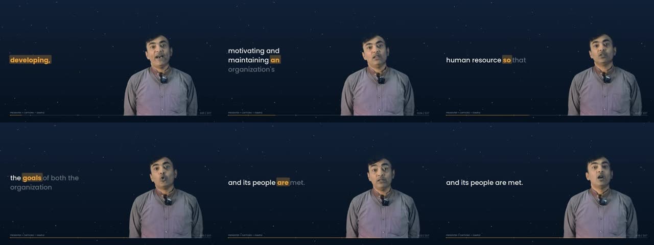
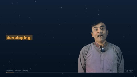
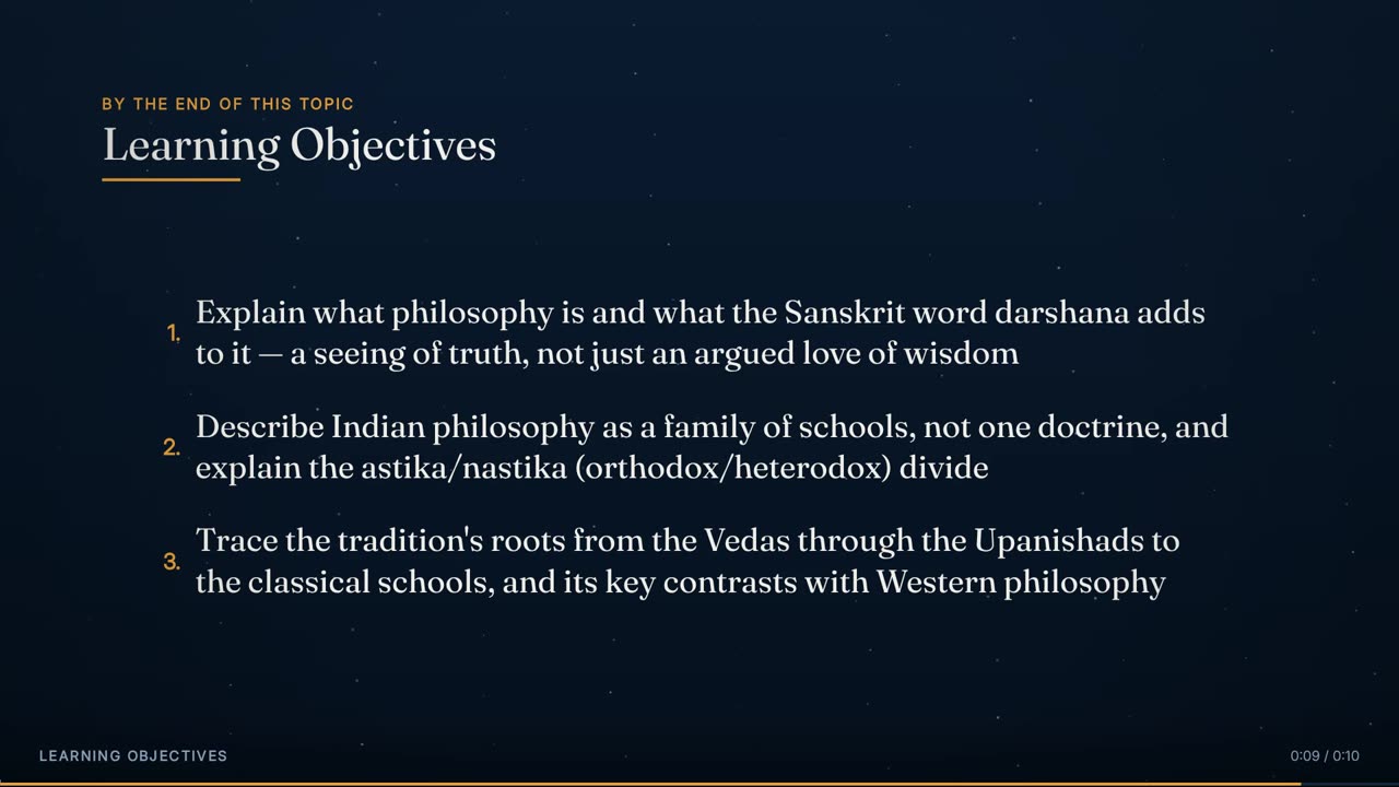
| Hard | The presenter never holds this layout for more than 15 seconds at a stretch. | A talking head holds attention without adding information. In short bursts it gives the lecture a human presence. Held for a minute and a half, it turns the lecture back into a recording of someone talking. |
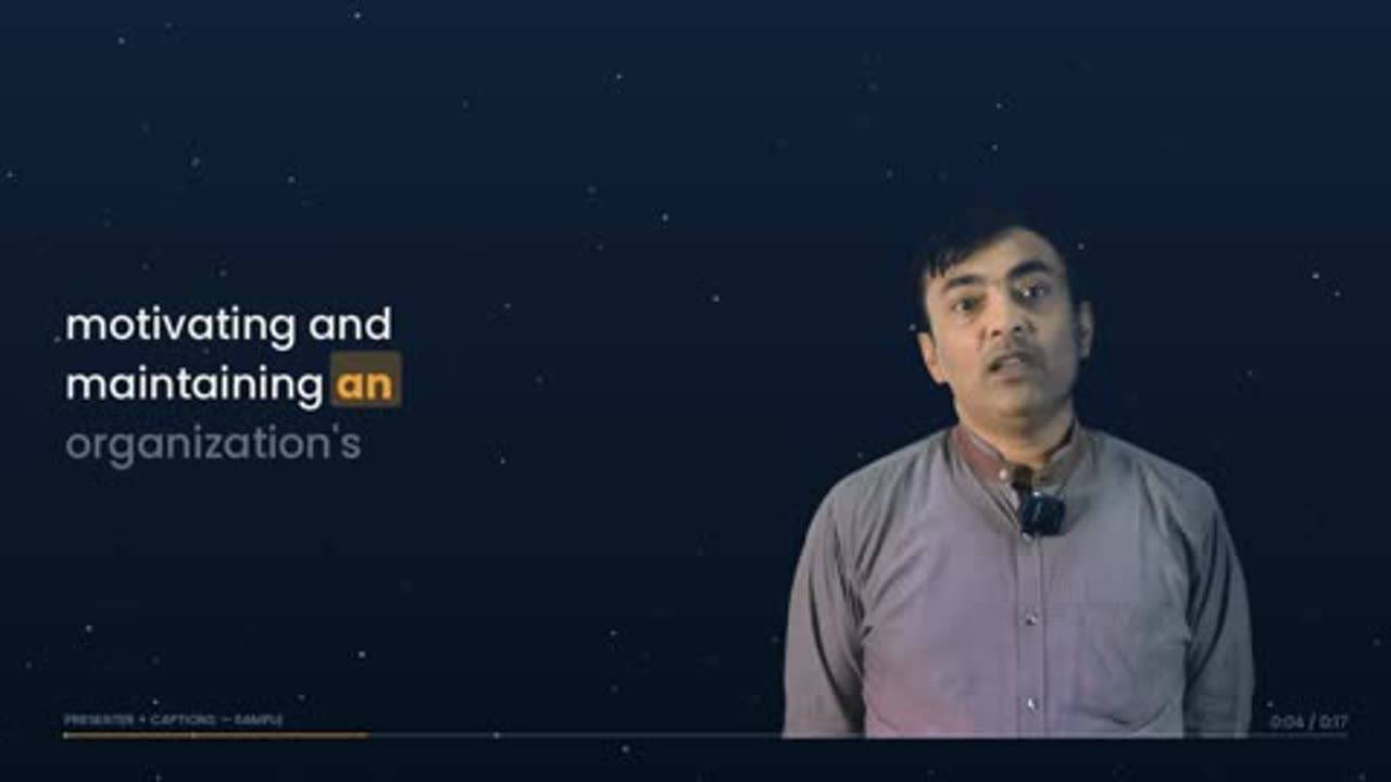
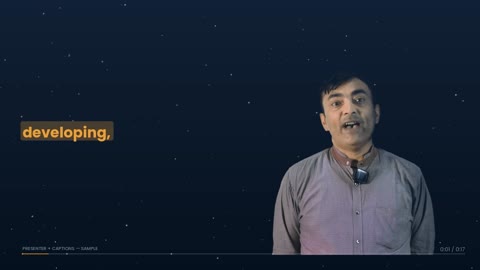
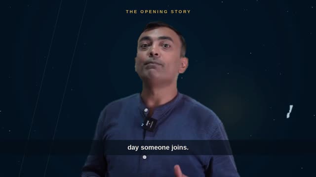
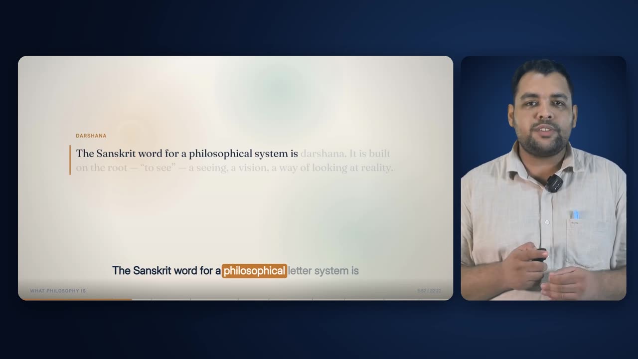
| Hard | Every lecture opens on Presenter + Captions and must be in an animated layout by 0:15. | A course needs a face before it needs a deck, but a lecture that stays on a talking head tells the viewer in fifteen seconds that it is only a recording. |
| Hard | Outside the opening, a Presenter + Captions or Presenter Centred cut lasts 4.5 to 15 seconds. | These framings are cuts, not scenes. Shorter than 4.5 s they read as a glitch. Longer than 15 s they start to become the format. |
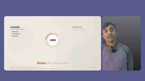
| Hard | This layout, with the other framings that are only the presenter, stays at or under 16% of the runtime; every framing with him in it stays at or under 66%. | The face is the most expensive thing on screen in attention terms, so it is capped, not scored — and capped tightly. The slide with the lecturer beside it is not a talking head and is not held to the same ceiling. |
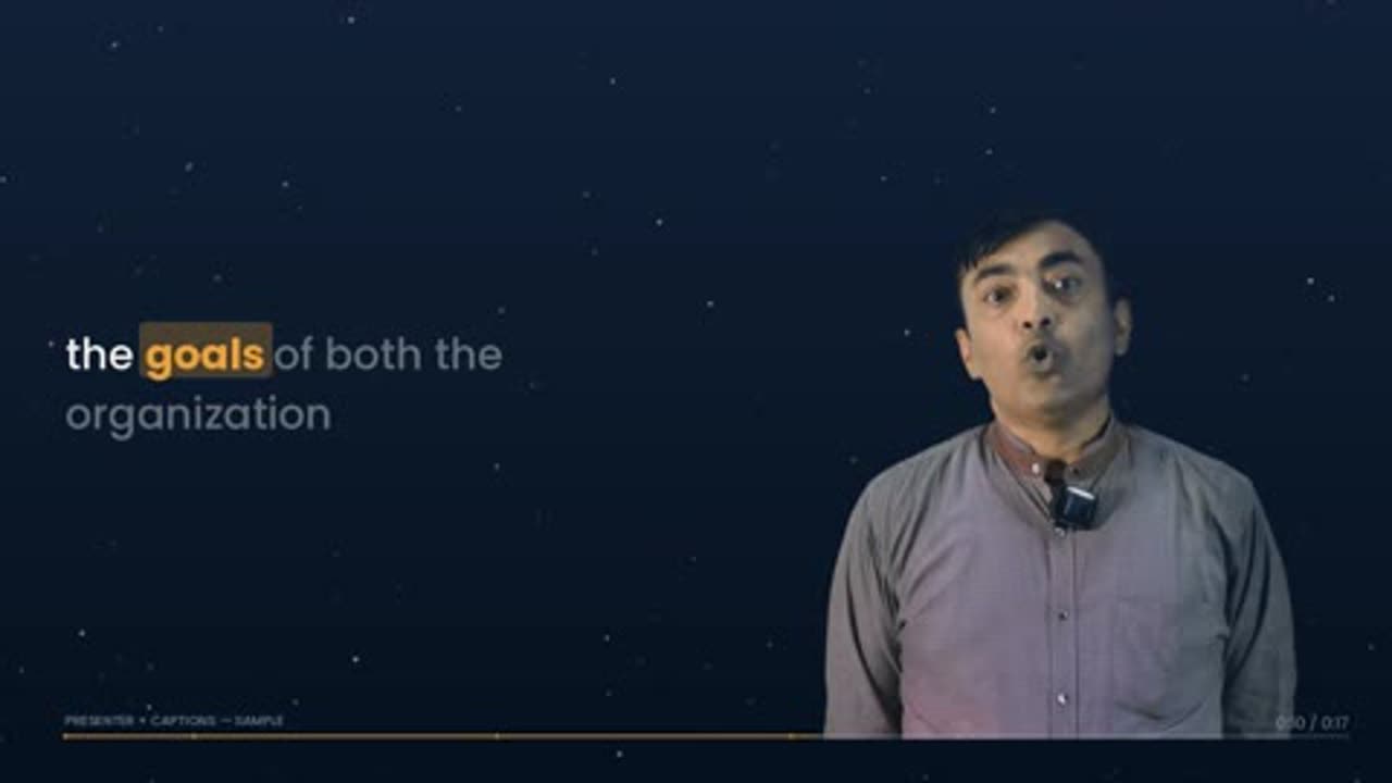
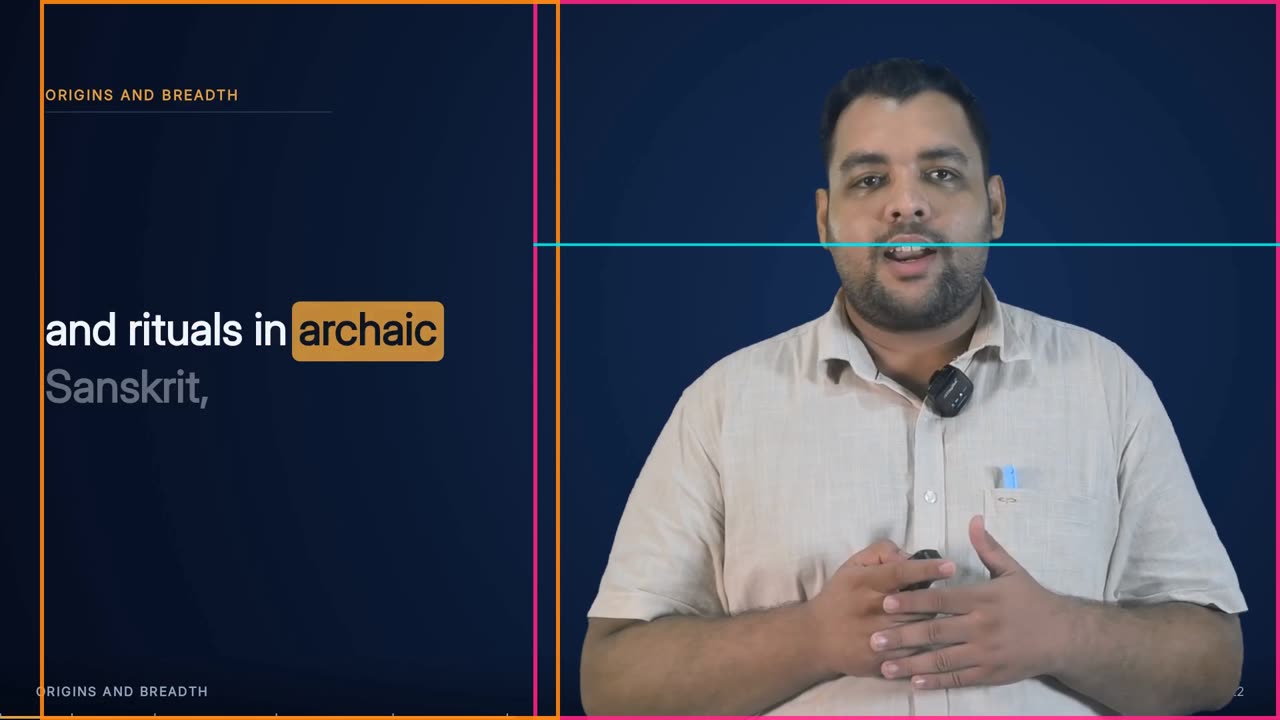
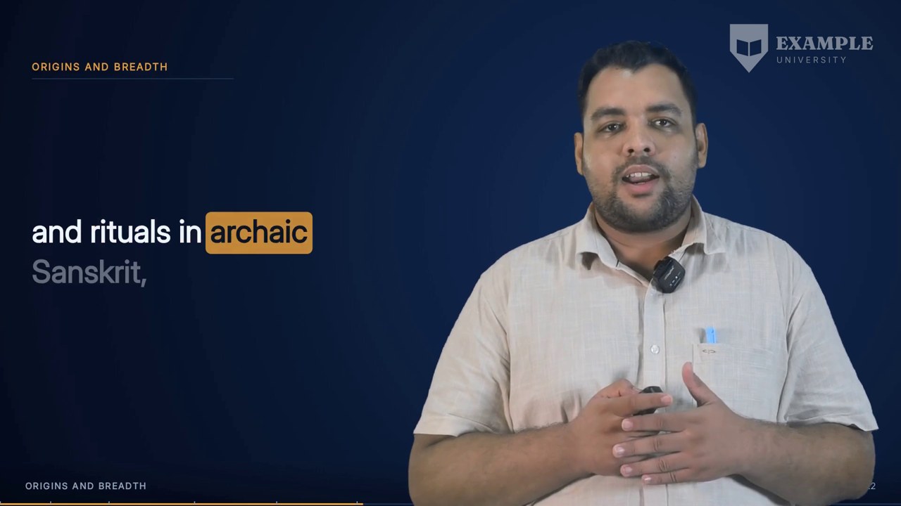
| Hard | The presenter stands on the right, in this layout and in Presenter + Animated. | The eye finds the face in the same place whatever the other half of the frame holds, so layout changes do not send the viewer searching. |
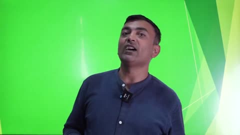
| Hard | The key is measured from this recording, and the build stops if no measurement exists. | A key borrowed from another lecture still forms a matte. It is just slightly wrong for the whole film, and nothing notices. |
| Hard | The key's reach is the smallest that clears the backing without costing any of the presenter. | A reach estimated from how evenly the cloth was lit once took a presenter's dark hair with it. The matte was perfectly formed, of the wrong person. |
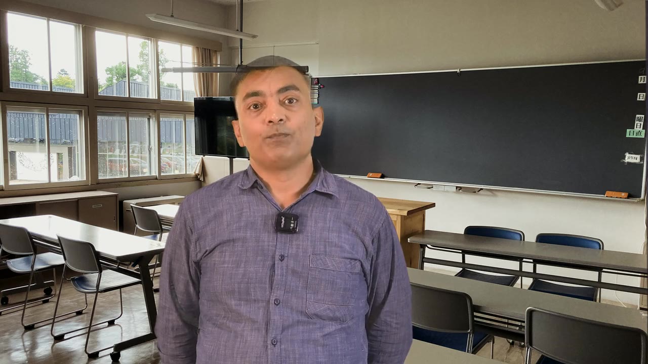
| Hard | The crop is the union of the presenter's movement across 48 frames of the whole recording, read at the 4th and 96th percentiles. | A crop taken from one frame looks right in a test still and then clips the head the moment the presenter takes a step. Percentiles keep a thrown arm but ignore a few frames of key noise. |
| Hard | The outer 5% of the frame on each side is ignored when finding the presenter. | The cloth rarely reaches the frame edge. The studio wall beyond it keys as foreground and once dragged a 950 px presenter's crop out to 1,410 px. |
| Guide | The presenter is sized to the frame height (1004 px), not to a panel width. | Fitted to a panel's width, the presenter came out a third of the frame tall with a wasted third of empty space above the head. |
| Hard | A measured landscape presenter changes the size of the split. It never removes the layout. | An earlier gate that preferred the card layout for wide subjects removed Presenter + Captions from a whole lecture, and the narrative beats that most wanted a face got a card instead. |
| Hard | The layout is removed only if no panel width puts the head at or above y = 270 with a column of at least 670 px. | Only then can the footage genuinely not be framed this way, and the plan records the numbers that decided it. |
| Hard | Caption phrases in the column are at most 6 words. | A narrow column cannot hold a nine-word line at a readable size. Shorter phrases wrap into a compact block instead. |
| Hard | Type is auto-fitted per phrase, from 66 px down to 30 px, until every line fits. | A punchy keyword phrase and a long qualifying clause should not share one size if one of them would clip. |
| Hard | Upcoming words show at 40%, spoken words at full ink, and the current word on an amber block. | The reader sees where the sentence is going without confusing it with what has been said. |
| Guide | The last phrase holds for 1.9 s after its last word, then fades over 0.9 s. | A short phrase should not flash and vanish while the presenter is still visibly mid-thought. |
| Guide | The shadow side of the presenter is lifted gently, and highlights are left exactly alone. | Lecture studios are lit from one side. The far cheek comes back two or three stops down, which reads as modelling on a bright backing but as a hole once the presenter is set on a dark ground. |
| Hard | One key-and-look treatment is shared by every presenter layout. | Two copies that drift by one control point make a film in which the presenter changes complexion at a cut. |
| Hard | The stage colours come from the template style and are the same in the live-drawn plate and the pre-drawn stages. | The frames meet at every cut between layouts, and a colour step there is the most visible flaw in the film. |
| Hard | Layout changes happen only at phrase boundaries. | A cut in the middle of a word looks like an editing error. |
| Hard | A cutaway over this layout carries the caption band. | A student following the text would otherwise lose their place exactly when the screen changes under them. |
| Hard | The layout carries no logo, course code or institution mark. | The output stays unbranded so the same render can serve any institution. The watermark is added by its own effect, at the end. |
| Hard | Every piece must match its expected frame count within 2 frames before anything is joined. | A piece at the wrong frame rate has the right duration but the wrong frame count, and would slide everything after it out of sync with the voice. |
| Hard | A piece is reused only if the footage, key, crop and look it was made from are unchanged. | A cache that only asks whether a file exists returns last week's answer to this week's question, silently. |