Engine/Effects/Branding

Logo

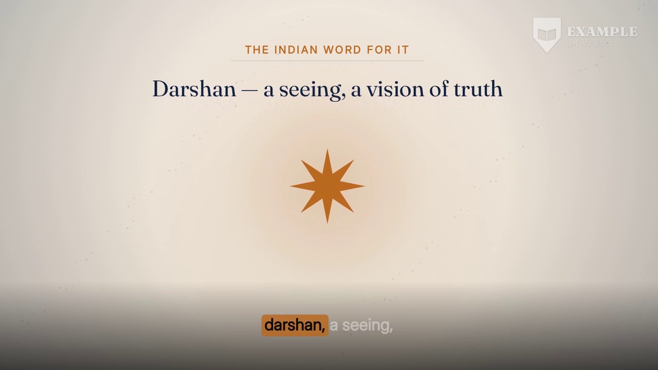
The institution's mark sits in the top-right corner of every frame of the finished film, from the first frame of the welcome card to the last frame of the key takeaways. It is drawn as a white mark with a soft shadow at 45% opacity, 320 pixels wide, so it reads on a dark stage, a bright photograph or a drawn scene without ever competing with the presenter or the slide.

white mark · 45% · top right · every frame

The finished effect

What it looks like when it is done.

Sixteen seconds of the 22-minute Indian Wisdom lecture used throughout this page with a logo in the top-right corner (a placeholder mark made for this page), in the default Monochrome style. In this style the mark does not move, fade or change size when the layout changes underneath it; seven other styles are below.

16 s · 1920 × 1080 · with sound

Overview

What it is, and why it exists.

A course is watched as a playlist, and a student who lands on lecture fourteen from a search result should know within a second whose course it is. The logo effect is the one persistent mark that answers that. It is applied last, after the lecture has been assembled and joined to its four framing cards, so it covers the whole runtime in a single pass and cannot blink off at a join.

Most university logo files are drawn for paper: the artwork sits on a solid white card. Laid over video, that is a white box with a logo in it, and lowering the whole box's opacity does not fix it; it turns into a grey haze block. So before anything is burned in, the white card is knocked out of the artwork, leaving only the marks and their antialiased edges. The prepared mark is then rendered as a white silhouette with a soft shadow, which is the product default because it stays legible over every layout the engine produces, light or dark.

The logo is mandatory. Every lecture carries it unless it is explicitly switched off for that lecture. It is also the only mark on the film: the animated lecture, the presenter layouts and every cutaway are deliberately built unbranded, with no lockups, course codes or supplier branding, so the institution's mark is added exactly once, in one place, at one strength.

It depends on two things only: the institution's logo file, supplied once per institution and prepared once, and the finished, joined film. It does not touch the audio, and it does not change the picture anywhere outside its own corner.

Top rightPosition
320 px of 1920Width
52 px from right, 44 px from topMargins
85% (Monochrome)Opacity
White mark, soft shadowTreatment
Every frame, cards includedCoverage
One burn-in over the joined filmPasses
On, unless switched off per lectureDefault

Eight styles

One mark, eight ways to wear it.

The default is Monochrome, because it reads on every layout the engine makes. A course can pick any of the other seven, and any style can borrow another's timing.

WatermarkThe full logo at 40–70% (50% by default). Visible, never competes with the content. The safest choice.
BugThe emblem only, full strength and small — about 7% of the frame width. The classic channel mark.
MonochromeThe logo in one colour: white with a soft shadow, or black for a dark mark. Reads cleanly on any footage. The default.
Glass badgeThe logo on a small rounded panel of blurred, tinted picture, so it stays readable over busy scenes.
Logo + tagThe emblem with a short label beside it: the course name by default, or an episode number or web address.
Animated inFades and slides in over the first seconds, then stays put; a light sheen crosses it once a minute.
PeriodicShown only at the start, the end and three points between, fading in and out. For content where screen space matters.
Corner accentA coloured triangle or open bracket in the corner with the emblem inside it in white. The colour is taken from the logo.

How it is made

Step by step, in the order the engine runs it.

Receive the institution's logo once

The university supplies its logo file, usually a PNG drawn for print. It is attached to the institution, not to a lecture, so every lecture in every course from that institution uses the same prepared mark.

Knock the white card out

Each pixel's transparency is recomputed from its darkest colour channel: alpha = 1 − min(red, green, blue). Pure white becomes fully transparent, a saturated stroke stays almost solid, and the grey ramp along an antialiased edge becomes the partial transparency it always should have been. The value is scaled against 235 rather than 255 and given a gentle 0.85 gamma so thin strokes and fine lettering survive. The new alpha never exceeds the file's original alpha, so rounded corners the designer already cut stay cut.

Trim to the artwork

Everything with an alpha of 8 or less is treated as empty, and the image is cropped tight to what remains. The mark's size on screen is then set by the artwork itself, not by however much blank margin the source file happened to carry.

Refuse a blank result

If nothing survives the knock-out, the build stops and says so. That happens when the supplied file is white artwork on a dark card, which needs the opposite treatment, and it is better to stop than to burn an invisible or inverted mark into a finished film.

Render the white mark with its shadow

The prepared silhouette is filled white and given a soft, low-offset shadow. White is the one colour that holds its contrast over the dark blue stage, over daylight photographs and over the drawn cutaways alike; the shadow is what keeps it legible on the rare bright patch, such as a white wall in a generated still.

Cache it

The prepared mark is saved beside the job, so the expensive image work happens once. Every later build of every lecture from that institution goes straight to the burn-in.

Wait for the film to be complete

The logo is applied only after the lecture has been assembled and joined to its welcome card, learning objectives, end note and key takeaways. Marking the pieces separately would leave the mark at risk of a one-frame gap or a shift at each of the four joins.

Burn it in, top right

The mark is scaled to 320 pixels wide with its height following the artwork's own proportions, set to 45% opacity, and overlaid with its right edge 52 pixels from the frame's right edge and its top 44 pixels from the top. On a 1920×1080 frame the mark therefore starts at x = 1548. The picture is re-encoded at high quality in a single pass; the sound is copied across untouched.

Check the marked film

The marked film is what the final delivery check traces: its sound must line up with the lecture's cut audio at exactly the expected offset, which proves the burn-in pass neither dropped nor shifted anything.

Elements

Everything this effect puts on screen, one piece at a time.

Each element below is shown as the engine actually produced it, in the real lecture, with its parts, and the rules that govern it.

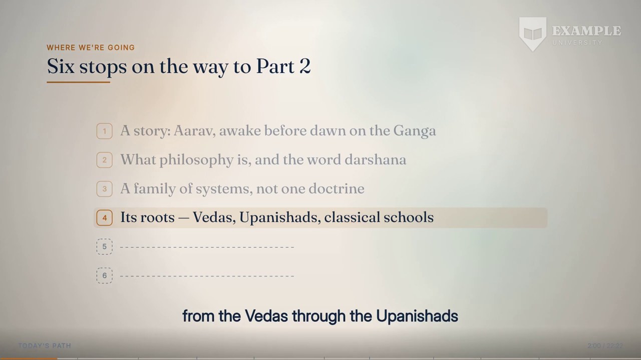
The corner of a Presenter Centred frame: the mark with no trace of the white card it was drawn on.
01

The prepared mark

The institution's artwork with its paper card removed.

The prepared mark is the logo as it should exist on video: the drawn shapes and nothing else. Because transparency is taken from the darkest channel at each pixel, the knock-out needs no hand-made mask, no colour picking and no threshold that would clip fine detail. Soft edges stay soft because a half-grey edge pixel becomes a half-transparent one. The same prepared file is reused for every lecture from that institution, which is also why the mark is identical across a course: nothing about it is recomputed per lecture.

Anatomy
  • Alpha = 1 − min(R, G, B), scaled against 235 and raised to the power 0.85
  • Never more opaque than the original file's own alpha
  • Cropped tight to pixels with alpha above 8
  • Stored once per institution and reused
Rules
  • White is removed, drawn marks are kept
  • A result with no visible pixels stops the build
  • The artwork is never redrawn or re-lettered

The top-right corner of the full animated lecture, with the white mark over the navy ground.
02

White mark with soft shadow

The product default treatment.

The film's backgrounds change constantly: a dark blue stage behind the presenter, a daylight photograph, a drawn scene on a navy ground, a deck slide. A full-colour crest that reads well on one of those disappears on another. A white silhouette is the one treatment that keeps its contrast across all of them, and the soft shadow under it gives it an edge against the occasional bright patch. At 45% the mark is clearly present but lighter than any text on screen, so it is read once and then ignored, which is what a watermark is for.

Anatomy
  • Fill: white
  • Shadow: soft, small offset, under the mark
  • Opacity: 45% for mark and shadow together
  • Width 320 px; height follows the artwork's proportions
Rules
  • One treatment for the whole film; it does not change per layout
  • Lighter than any caption or slide text
  • The institution's own colours are never used to recolour anything else in the film
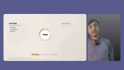
The corner of the Presenter + Animated layout: the mark sits in the stage margin above the presenter's card.
03

The corner box

Where the mark lives, and the space every layout keeps clear for it.

The mark occupies a fixed box: right edge 52 pixels in from the frame edge, top edge 44 pixels down, 320 pixels wide. That corner is outside every content area the engine draws. In Presenter + Animated the slide and presenter cards begin 168 pixels from the top, so the mark sits in the stage margin above the presenter's card rather than on it. In the other layouts the corner holds background, not text, so nothing important is ever under the mark.

Anatomy
  • Left edge at x = 1548 on a 1920-wide frame
  • Top edge at y = 44
  • Right margin 52 px, top margin 44 px
  • Above the 168 px top line of the Presenter + Animated cards
Rules
  • Top right in every lecture, never moved per scene
  • No layout places text or a face in this corner
  • Size and position are the same for every lecture in a course
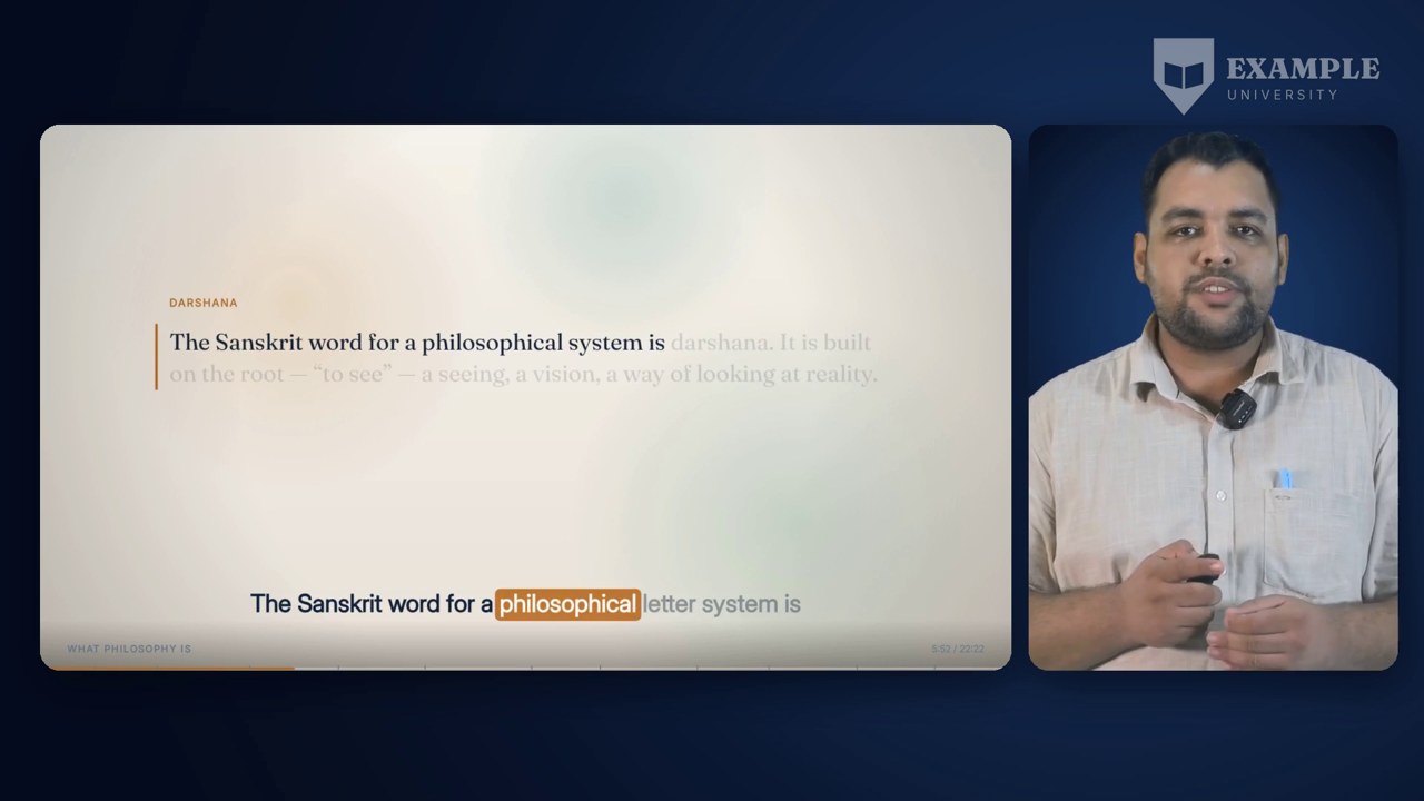
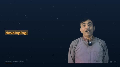
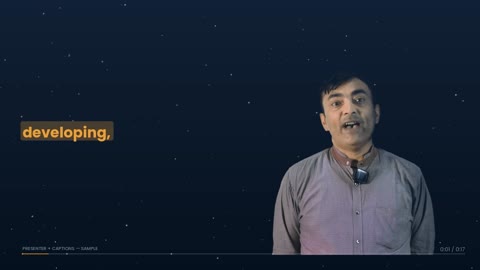
Presenter + Captions with the mark in the top right, above the presenter's side of the frame.
04

Over the presenter layouts

The mark beside a real person.

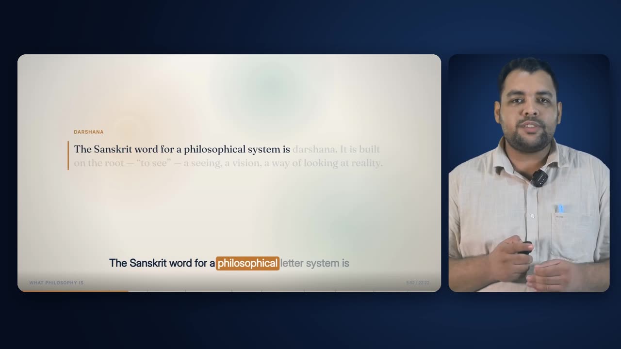
In Presenter + Captions the presenter stands on the right, scaled to very nearly the full frame height, and the corner above his shoulder is keyed-out stage. The mark sits in that space, clear of his head, which is placed by the measured head line of the recording rather than by a guess. Because the presenter is always on the right in both side-by-side layouts, the mark and the face share the same side of the screen throughout, and the eye learns where both are.

Anatomy
  • Presenter scaled to 1004 px tall in Presenter + Captions
  • Stage background in the corner behind the mark
  • Mark and presenter on the same side of the frame
Rules
  • The mark never overlaps the presenter's head in a measured crop
  • The mark is not dimmed or hidden when the presenter is on screen
A full animated lecture frame carrying the mark in its top-right corner.
05

Over the animated lecture

The mark over the drawn deck.

The full animated lecture fills the whole frame with the chapter's ground, headings and diagrams. Its elements are laid out inside a content area that stops short of the top-right corner, so the mark lands on ground, not on a heading. At 45% white it sits a step below the deck's own text in contrast, so it never reads as part of the slide.

Anatomy
  • Navy ground of the lecture's template style behind the mark
  • Deck content kept inside its own margins
  • Mark contrast below the deck's text contrast
Rules
  • The deck is rendered unbranded; the mark is the only identity on it
  • No deck element is designed into the top-right corner
The Presenter + Animated layout with the mark in the stage margin above the presenter's card.
06

Over Presenter + Animated

The mark over the two-card stage.

Presenter + Animated puts the slide in a rounded card on the left and the presenter in a rounded card on the right, on a dark stage. The mark sits in the 168-pixel stage margin above the cards, which is plain background, so it reads as part of the frame rather than as something laid over the slide or the person.

Anatomy
  • Slide card 1310×736 at (54, 168)
  • Presenter card 498×736 at (1387, 168)
  • Mark inside the top stage margin
Rules
  • The mark does not overlap either card
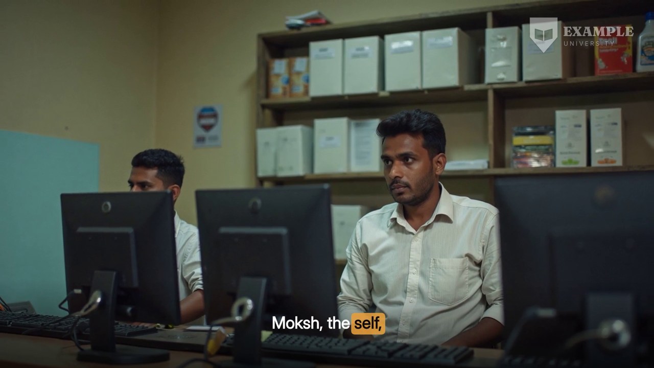
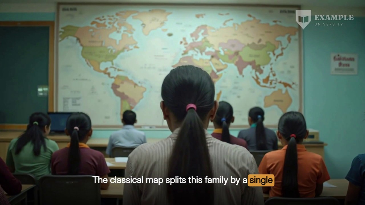
A generated still cutaway with the mark in its top-right corner.
07

Over generated pictures

The mark over photographic cutaways.

Generated stills are photographic and can be bright anywhere in the frame, including the top-right corner. This is the case the soft shadow exists for: when the corner of a picture is a pale sky or a white wall, the shadow gives the white mark an edge. The picture itself is never cropped or darkened to make room.

Anatomy
  • Full-frame generated still, moving gently
  • Caption band at the bottom, mark at the top
  • Shadow carries the mark over a pale corner
Rules
  • Pictures are generated without logos or text, so the mark is never next to a competing one
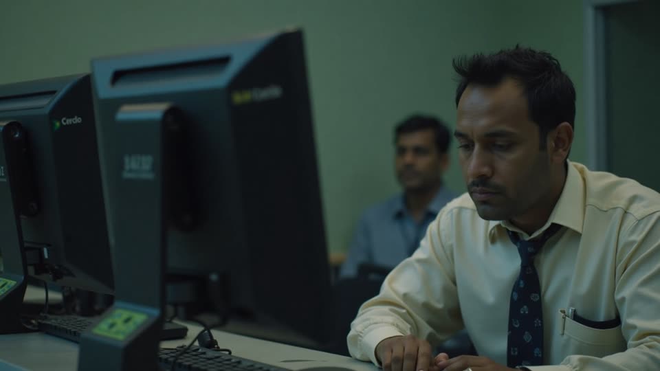
A generated video cutaway carrying the same mark, unchanged.
08

Over generated video

The mark over motion cutaways.

Generated video cutaways move, so the brightness under the corner changes from frame to frame. A white mark with a shadow holds up through that change where a coloured crest would fade in and out of view. The mark stays put and does not animate; only the picture under it moves.

Anatomy
  • Full-frame video cutaway
  • Static mark over moving picture
Rules
  • The mark does not follow, fade or react to the picture
A drawn cutaway with the mark in the top right.
09

Over drawn cutaways

The mark over the engine's own drawn scenes.

Drawn cutaways are rendered by the engine on the template style's ground, so their corners are dark and plain by design. The mark reads there exactly as it does over the animated lecture, which keeps a cut between the deck and a drawn scene from shifting the one fixed thing on screen.

Anatomy
  • Drawn scene on the style's ground
  • Same mark, same box, same strength
Rules
  • Drawn scenes are built without their own branding
Sixteen seconds of a finished, marked film, with the mark holding still through a layout change.
10

Across the framing cards

The mark on the welcome, objectives, end note and takeaways.

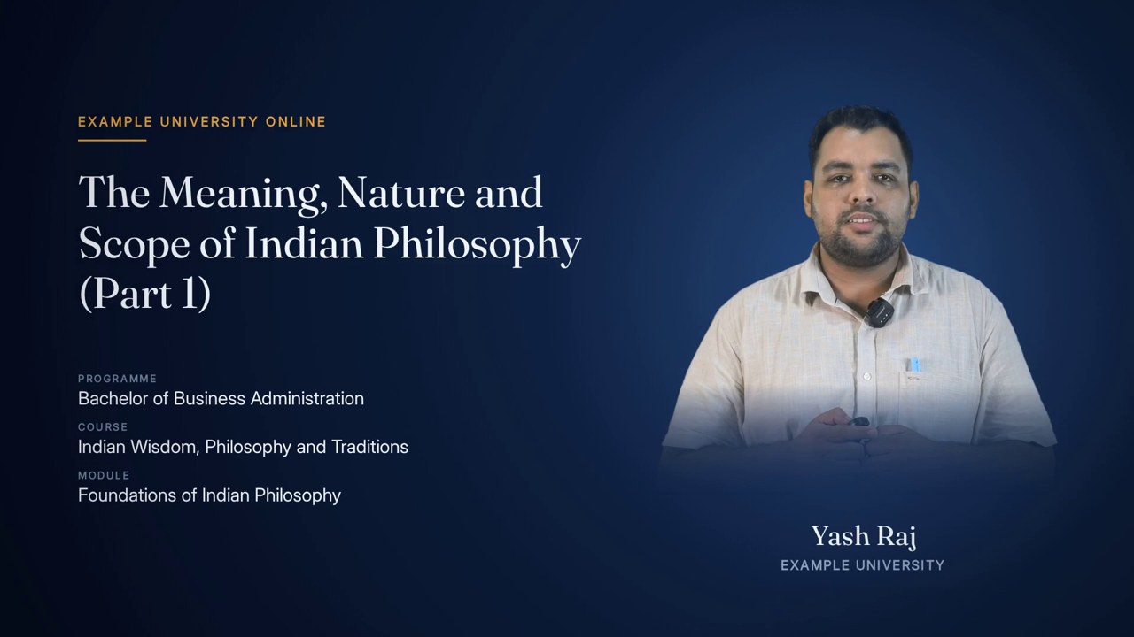
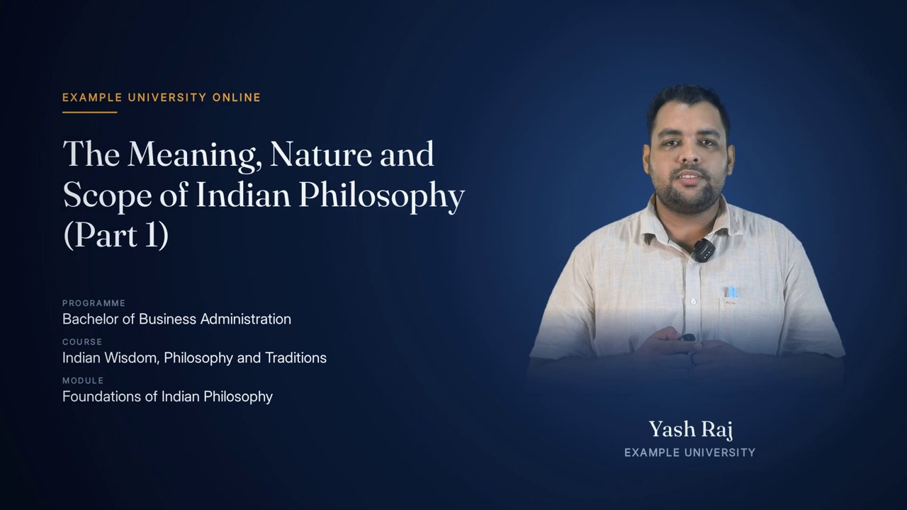
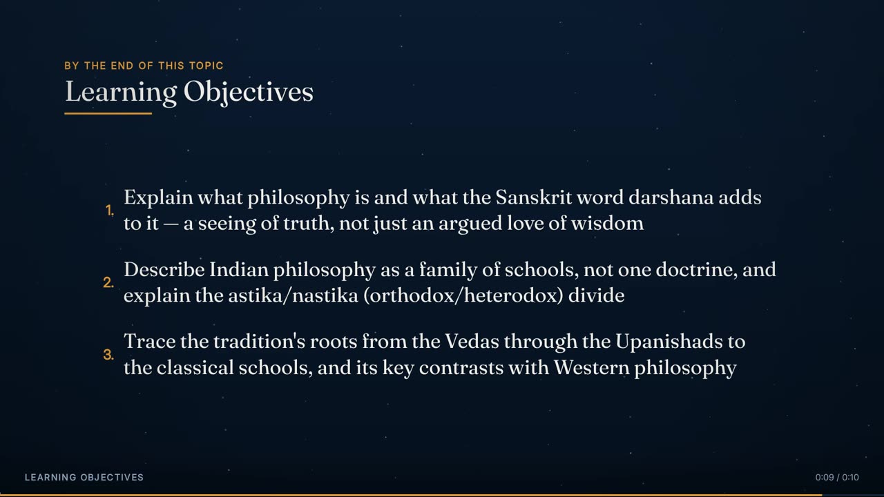
The four framing cards are part of the film, so they carry the mark too. The burn-in is applied after the cards are joined to the lecture, which means the mark is present from the first frame of the welcome card and does not flicker at any of the four joins. On the welcome and end-note cards the portrait sits well below and left of the corner, so mark and presenter never touch.

Anatomy
  • Present from frame 1 of the welcome card to the last frame of the takeaways
  • No joins inside the burn-in pass
Rules
  • Applied once, to the joined film, never piece by piece

Rules

The rules, and the reason for each.

Hard rules are checked by the engine and stop delivery if they fail. Guides steer the choice but can give way when the lecture needs it.

TypeRuleWhy
HardEvery lecture carries the institution's logo unless it is explicitly switched off for that lecture.A course is recognised by consistency; a lecture without the mark looks like it came from somewhere else.
HardThe mark goes in the top-right corner, 52 px from the right edge and 44 px from the top.One fixed place is learned in a second and then ignored; a moving mark keeps drawing the eye.
GuideThe mark is 320 px wide on a 1920 px frame, with height following the artwork.Large enough to identify at a glance on a phone, small enough to stay out of the content area.
GuideThe default treatment is a white mark with a soft shadow at 45% opacity.White holds contrast over every background the engine produces; the shadow covers the rare bright corner; 45% stays below the weight of any text.
HardThe white card behind print artwork is removed before the mark is used.Dimming a white card over video produces a grey haze block rather than a watermark.
GuideTransparency is taken from the darkest channel, so antialiased edges become partial transparency.Keeps soft edges and thin strokes intact without hand-drawn masks.
HardThe logo artwork is never redrawn, re-lettered or recomposed.A university's mark is not ours to change; only the background card is removed.
HardIf the knock-out leaves nothing visible, the build stops.That means white artwork on a dark card was supplied, and burning an empty or wrong mark into a film is worse than stopping.
HardThe mark is burned in once, over the fully joined film.Marking pieces separately risks a gap or jump at each of the four joins between cards and lecture.
HardThe mark is present on the four framing cards as well as the lecture.The cards are part of the film; a mark that appears only after the welcome looks like a late correction.
HardThe logo is the only brand mark on the film.Every other layer is built unbranded; the engine adds no supplier or product branding of its own.
HardGenerated pictures and video contain no logos or text of their own.Nothing on screen competes with, or is confused with, the institution's mark.
GuideNo layout places text or a face in the logo's corner.The mark should only ever sit over background.
GuideThe mark does not animate, fade or react to what is under it.A watermark's job is to be constant.
HardThe sound is copied through the logo pass untouched.The audio is already finished and levelled; re-encoding it would only cost quality.
GuideThe prepared mark is cached and reused for every lecture from that institution.Identical marks across a course, and the image work is done once.

Settings

Every setting, with its value.

These are the values the engine runs with today. The name in small type is the setting as it appears in the engine, for anyone comparing notes with a producer.

SettingValueWhat it does
OpacityOPACITY45% (product default; the engine's original constant was 20%)How strongly the mark shows. Tunable per institution, but one value for a whole course.
Mark widthWIDTH320 px of 1920The mark's on-screen width. Height follows the artwork's own aspect ratio.
Right marginMARGIN_X52 pxDistance from the mark's right edge to the frame's right edge.
Top marginMARGIN_Y44 pxDistance from the mark's top edge to the top of the frame.
TreatmentWhite with a soft shadowThe product default. The institution's original colours can be kept instead if a university asks for it.
Knock-out scale235Darkness is measured against 235 rather than 255, so near-white paper counts as fully transparent.
Knock-out gamma0.85A slight lift to partial transparency so thin strokes and small lettering survive.
Empty-pixel cut-offalpha 8 of 255Anything fainter is treated as empty when the mark is trimmed to its artwork.
Logo on or offOnMandatory by default; switched off only by an explicit per-lecture setting.
Picture quality of the passHigh-quality constant-quality encode, one passThe film is re-encoded once with the mark; the audio stream is copied.

Checks

What is verified before it ships.

The prepared mark is not blank

After the white card is removed there must be visible pixels left, or the build stops with an explanation.

The burn-in pass completed

A failed pass stops the build; a half-marked film is never delivered.

The marked film's sound traces back to the lecture

The final delivery check cross-correlates the marked film's sound with the lecture's cut audio at three points and requires it to sit at exactly the expected offset after the welcome and objectives.

The mark is the only brand on screen

Generated pictures and clips are gated for logos and signage before placement and re-checked after, so no competing mark reaches the film.

Corner inspection

Frames from every layout and every cutaway type are pulled and the top-right corner inspected, which is what the visuals on this page are.

Worked example

In a real lecture

The mark on these samples is a placeholder logo made for this page, so no real institution's identity appears in the examples. A real logo goes through exactly the same steps: the white card around it is knocked out once, the prepared mark is recoloured white with a soft shadow, and it is reused for every lecture after that.

On the 22-minute Indian philosophy lecture, the marked film runs 22 minutes 52 seconds: a 5-second welcome, 10 seconds of learning objectives, the lecture itself, a 5-second end note and 10 seconds of key takeaways. The mark is on every one of those frames, over 45 layout runs in four layouts and 50 cutaways of three kinds, without a single join inside the pass that applies it.

The frames and the 16-second sample on this page come from another lecture in the same batch, chosen because its plan puts every layout and every cutaway type within easy reach; the mark, its size and its place are identical.

22:52Film length
about 41,160 at 30 fpsFrames marked
45Layout runs under the mark
50 (22 pictures, 9 video, 19 drawn)Cutaways under the mark
320 px wide at (1548, 44)Mark
1Passes

Limits

What it deliberately does not do.

  • It does not recolour, redraw or tidy an institution's artwork; a poor source file produces a faithful copy of a poor mark.
  • It cannot knock out a dark card behind white artwork; that file needs to be supplied the other way round, and the build stops rather than guessing.
  • It does not move the mark out of the way of anything; layouts are designed to keep the corner clear instead.
  • It does not animate the logo, add a sting or an end-card lockup; the framing cards carry the institution's name in type instead.
  • It does not add Lecture Studio branding or any supplier mark to the film.
  • It is not a security watermark: it identifies the course, it does not prevent copying.

Works with

How it meets the other effects.

Questions

What educators ask about it.

Can we keep our logo's colours instead of a white mark?

Yes. The knock-out keeps the original colours, and the white treatment is applied on top of it as the default because it reads on every background. A course can choose the coloured version; it will be the same size and in the same place.

Our logo file has a white background. Is that a problem?

No. That is the usual case. The white card is removed automatically before the mark is used, and soft edges are preserved.

Can a lecture go out without the logo?

Only if it is switched off explicitly for that lecture. The default is on, because a course that is inconsistent about its mark looks unfinished.

Why so faint?

At 45% the mark is clearly visible but lighter than any word on screen, so it identifies the course without pulling attention from the teaching. The strength is a setting if a university wants it heavier.

Will it cover anything important?

Every layout keeps the top-right corner as background: the presenter cards start 168 pixels down, the deck keeps to its own margins, and generated pictures carry no text.

All effects

Every effect has a page like this one.

See this effect on your own lecture.

Send a recording and we'll run it through the pipeline as a pilot — one free sample per institution.